Designing Websites for Shorter Attention Spans: Essential Strategies for 2026
In this crazy online world, people just don't stick around for long. Between all the pings and pop-ups, they're gone before you can even say 'welcome'. So, how do you make a website that actually keeps them looking? Designing Websites for Shorter Attention Spans in 2026 is all about making things super clear and fast. We're talking about grabbing their eyes right away and making sure they can find what they need without any fuss. It’s a different ballgame now, and your website needs to keep up.
Key Takeaways
- Make a strong first impression immediately with clear, bold headlines and a design that's easy to get right away. The hero section is your prime real estate for this.
- Speed is everything. Aim for pages that load in under three seconds. Cut down on fancy animations and make sure images and videos are small enough for quick loading, especially on phones.
- Keep your website's navigation simple and straightforward. Users should be able to find what they're looking for with just a few clicks, without getting lost.
- Write content that's easy to scan. Use short sentences, bullet points, and clear headings instead of long blocks of text. Visuals can help tell the story faster.
- Tell people what you want them to do with clear calls to action. Place testimonials where they'll be seen to build trust, and use action-oriented language.
Capturing Attention Instantly for Shorter Attention Spans in 2026
Crafting Immediate Impact with Bold Headlines
When someone lands on your website today, you've got maybe a blink of an eye to make them stick around. Forget long intros or fancy explanations. Your headline needs to tell them exactly what you're about and why they should care, right now. Think of it as the digital handshake – it needs to be firm and clear. A fuzzy or generic headline is like a weak handshake; people just move on.
Here's what makes a headline work:
- Clarity: No jargon, no riddles. What do you do? What problem do you solve?
- Benefit-driven: How does this help the visitor? What's in it for them?
- Conciseness: Short and to the point. Every word counts.
A headline that immediately answers the visitor's unspoken question, "What's in this for me?" is a headline that wins.
Designing for Instant Comprehension
Beyond the headline, the whole first impression needs to be crystal clear. Visitors aren't going to hunt for information. They want to understand what your site offers within seconds of arriving. This means the visual design and the initial text must work together to convey your core message instantly. If there's any confusion, they'll bounce.
Consider these points for quick understanding:
- Visual Hierarchy: The most important elements should be the most prominent. Use size, color, and placement to guide the eye.
- Clear Value Proposition: State what you do and for whom, simply and directly, near the top of the page.
- Minimal Clutter: Avoid overwhelming visitors with too much information or too many design elements at once.
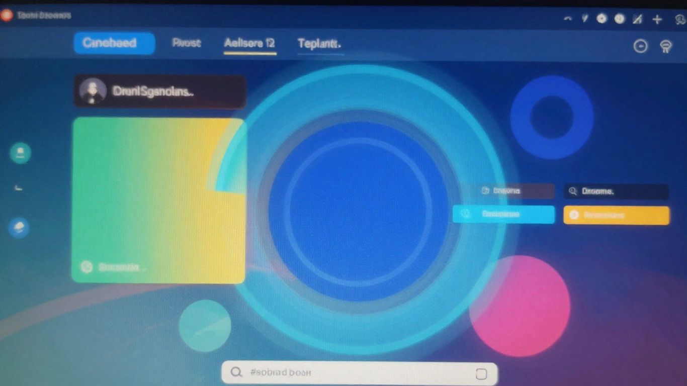
The Crucial Role of the Hero Section
The hero section – that prime real estate at the top of your homepage – is your first and best chance to grab someone. It's where your headline, a strong visual, and a clear call to action (or at least a hint of one) come together. This section has to do a lot of heavy lifting, fast.
Think about what needs to be in your hero section:
- A compelling headline: As we discussed, this is non-negotiable.
- A relevant, high-quality image or video: It should support your message and be engaging without being distracting.
- A brief supporting statement: Just a sentence or two to add context.
- An initial call to action: What's the very next step you want them to take?
Optimizing Website Performance for Impatient Users
Let's be real, nobody likes waiting. Whether you're waiting for a bus or for a webpage to load, it's just plain annoying. In 2026, this impatience is even more pronounced online. Studies show that if a website takes more than a few seconds to load, people are likely to just click away and find something else. This means your site's speed isn't just a nice-to-have; it's a make-or-break factor for keeping visitors engaged and turning them into customers.
Achieving Sub-Three-Second Load Times
Getting your website to load quickly is a big deal. Think of it like this: a slow website can cost you business. A delay of just one second can actually reduce conversions by a noticeable amount. So, aiming for that sub-three-second mark is pretty much the standard now. It signals professionalism and helps build trust with your audience right from the start.
Here are some practical steps to speed things up:
- Audit Your Speed: Use tools like Google's PageSpeed Insights. It gives you a starting score and points out exactly what needs fixing.
- Compress Images: Tools like TinyPNG can shrink image files without making them look bad. Smaller files mean faster loading.
- Enable Caching: This is like giving your website a short-term memory. It stores parts of your site in a visitor's browser, so it loads much faster the next time they visit.
- Minify Code: This involves cleaning up your website's code (like CSS and JavaScript) by removing extra characters. It makes the files smaller and quicker to load.
Streamlining Motion Effects and Animations
Animations and fancy motion effects can look great, but they can also really slow down your website. If your pages are taking ages to load, those cool animations might be the culprit. It's often better to simplify them or even remove them if they're causing a performance hit. Visitors want to see your content, not wait for a spinning graphic to finish.
Optimizing Media for Mobile Speed
Images and videos are important for making your website look good, but they can also be heavy. This is especially true on mobile devices where connection speeds can vary. Using modern file formats like WebP for images or MP4 for videos can help keep file sizes down while maintaining good quality. It's all about making sure your media looks good without making your visitors wait around.
The faster your website loads, the more likely people are to stick around and see what you have to offer. It's a simple equation: speed equals engagement, and engagement leads to results.
Streamlining User Journeys with Intuitive Navigation
Getting people to your website is only half the battle. Once they land, they need to find what they're looking for without a headache. Think about it: if you can't quickly find the information or product you need, you're probably just going to click away, right? That's why making your website's navigation super clear and simple is a big deal, especially now.
Simplifying Menu Structures
Nobody wants to sift through a massive list of options. Keep your main menu short and sweet. Aim for around five to seven top-level items. If you have a lot of content, use dropdowns or mega menus, but make sure they're organized logically. Think about what users are trying to do on your site and group related items together. It's like organizing a store – you put all the dairy products in one section, not scattered all over.
- Group similar items: Put 'About Us' and 'Contact' together, or 'Products' and 'Services'.
- Use clear labels: Avoid jargon. Instead of 'Synergistic Solutions', try 'Business Help'.
- Limit top-level items: Keep the main menu uncluttered.
Guiding Users with Clear Pathways
Once someone is on a page, they should know where they are and how to get to other related pages. Breadcrumbs are great for this – they show the user their path from the homepage to the current page, like Home > Services > Web Design. Also, make sure your internal links are descriptive. Instead of just saying 'click here', say 'Learn more about our web design services'. This helps both users and search engines understand your site's structure.
Users should never have to guess where they are or where to go next. Every click should feel like a step forward, not a random jump.
Ensuring Predictable Layouts
People get used to how websites generally work. The logo is usually in the top-left, the navigation across the top or down the side, and contact info in the footer. Stick to these common patterns. When you put things where people expect them to be, they don't have to waste mental energy figuring out your site. This consistency makes the whole experience feel smoother and more trustworthy. It’s about making the user’s journey feel familiar and easy, no matter what page they land on.
Content Strategies for Scannable and Engaging Experiences
Prioritizing Brevity in Text
Look, nobody has time to read a novel on a website anymore. If your text is dense and rambling, people will just bounce. We need to get straight to the point. Think short sentences, short paragraphs. Every word needs to earn its keep. If you can say it in five words, don't use ten. This isn't about dumbing things down; it's about respecting people's time. They're here for information or a solution, not a literature class.
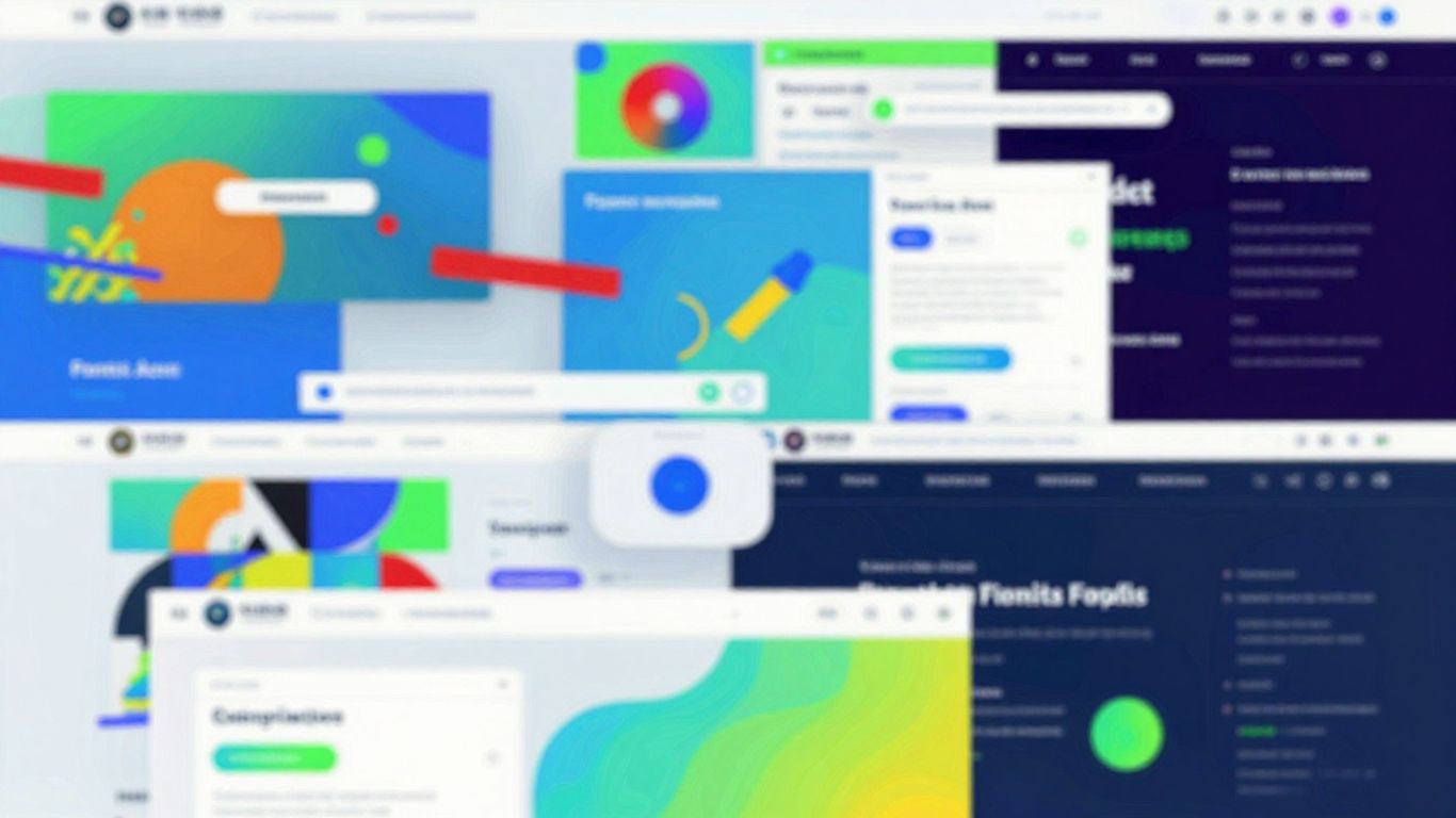
Leveraging Visuals to Convey Information
Sometimes, a picture really is worth a thousand words, especially when those words are going to be skimmed over. Charts, infographics, even well-chosen photos can explain complex ideas way faster than a block of text. Think about how you can show, not just tell. This makes your content easier to digest and remember. It's like giving your audience a shortcut to understanding.
Here’s a quick look at how visuals can help:
- Speed: Visuals are processed much faster than text.
- Clarity: Complex data can be simplified with charts or graphs.
- Engagement: Images and videos naturally draw the eye.
Structuring Content for Easy Scanning
People don't read websites; they scan them. They're looking for keywords, headings, and anything that jumps out. So, we need to make it super easy for them. Use clear headings and subheadings to break up your content. Bullet points and numbered lists are your best friends here. They make information digestible at a glance. Imagine your content is a busy street – headings are the street signs, and lists are the clear lanes.
When users land on a page, they're usually on a mission. They want to find something specific, fast. If they can't quickly scan and locate what they need, they'll leave. Making your content scannable isn't just a nice-to-have; it's a necessity for keeping visitors on your site.
Building Trust and Driving Action with Clear Calls
Strategic Placement of Testimonials
People want to know others have had good experiences before they commit. Showing off what happy customers have said is a smart move. Think about putting short, impactful quotes right where people are thinking about taking the next step, like near a sign-up form or a 'buy now' button. It's not just about having testimonials; it's about putting them where they can do the most good. Make sure they look real, too – a name, maybe a job title, and a photo can go a long way.
- Homepage: Feature a rotating selection of your best reviews.
- Product/Service Pages: Include testimonials specific to that offering.
- Checkout/Form Pages: Add a brief, reassuring quote to reduce last-minute doubts.
Trust signals like genuine customer feedback act as silent salespeople, reassuring potential customers and reducing the friction that often stops them from converting.
Designing Compelling Call-to-Action Buttons
Your website needs to tell people exactly what you want them to do. A clear call-to-action (CTA) button is like a friendly signpost. It shouldn't blend in; it needs to stand out. Use action words that tell people what will happen when they click. Instead of a boring 'Submit,' try something like 'Get Your Free Guide' or 'Start My Trial.' The color of the button matters too – pick something that pops against your site's background. Make sure it's easy to find, ideally without making people scroll too much.
Using Action-Oriented Language
What you say on your buttons and links makes a big difference. Using words that prompt action gets people moving. Think about what the user gains by clicking. Phrases like 'Claim Your Discount,' 'Download the Report,' or 'Schedule a Quick Chat' are much more effective than generic terms. This direct language removes guesswork and makes the user's next step obvious and appealing. It's about making the benefit clear and immediate.
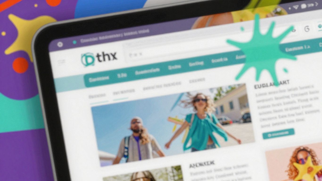
Designing for a Mobile-First World in 2026
Let's face it, in 2026, if your website isn't built with mobile users in mind from the ground up, you're basically missing out on a huge chunk of potential visitors. Most people are scrolling on their phones these days, so designing for that small screen first isn't just a good idea, it's pretty much the only way to go. It means your site needs to look and work great on a smartphone, and then you scale it up for tablets and desktops. This approach helps make sure your site is functional and looks good no matter what device someone is using. It's also a big deal for search engine visibility, as Google pays close attention to how well your site performs on mobile.
Embracing Responsive Design Principles
Responsive design is the backbone of a mobile-first strategy. It's about making your website flexible. Instead of having separate sites for desktop and mobile, responsive design uses fluid grids and adaptable layouts. This means your content reflows and images resize automatically to fit whatever screen size your visitor is using. It's like a chameleon for your website, changing its appearance to suit its environment.
Prioritizing Mobile-Friendly Layouts
When you're thinking mobile-first, you're designing for the smallest screens first. This means:
- Keep it simple: Avoid clutter. Use clear, readable fonts and plenty of white space.
- Big buttons: Make sure buttons and links are easy to tap with a finger. No more tiny targets!
- Vertical flow: Content should generally flow downwards, making it easy to scroll through.
- Thumb-friendly navigation: Place important navigation elements where they're easy to reach with a thumb.
This way, you're building the core experience for the majority of users, and then expanding it for larger screens. It's a much more efficient way to build a site that works everywhere.
Ensuring Seamless Cross-Device Functionality
Beyond just looking good on different devices, your website needs to work flawlessly. This means:
- Consistent experience: Users should have a similar, intuitive experience whether they're on their phone, tablet, or desktop.
- Fast loading: Mobile users are notoriously impatient. Aim for pages that load in under three seconds. This often means optimizing images and code.
- No broken elements: Forms should submit correctly, videos should play, and interactive elements should respond as expected on all devices.
Building a website that works well across all devices isn't just about looking good; it's about making it easy for people to find what they need and do what they want, quickly and without frustration. This directly impacts how long they stay and whether they come back.
Testing is key here. Use tools to check how your site performs on various devices and screen sizes. It might seem like a lot of work, but getting this right means a better experience for everyone who visits your site, which is good for business.
Enhancing User Experience Through Inclusivity and Engagement
Making your website work for everyone isn't just a nice-to-have anymore; it's a must. By 2026, people expect sites to be easy to use, no matter who they are or what device they're on. This means thinking about accessibility from the start and adding little touches that make the experience feel more personal and responsive.
Adhering to Accessibility Standards
This is non-negotiable. Websites need to be usable by people with disabilities. Think about things like making sure your site can be navigated with a keyboard, that text can be resized, and that there's good color contrast. It's not just about following rules; it's about opening your doors to more people and showing you care. Plus, search engines tend to like accessible sites more, which is a nice bonus.
- Keyboard Navigation: Users should be able to tab through all interactive elements.
- Alt Text for Images: Describe images for screen readers.
- Clear Form Labels: Associate labels directly with their form fields.
- Resizable Text: Allow users to zoom or increase font size without breaking the layout.
Building trust is a big part of this. When users can easily access and use your site, they see your brand as more reliable and professional. It’s about making sure no one feels left out.
Incorporating Microinteractions for Feedback
These are the tiny animations or visual cues that happen when a user does something, like clicking a button or submitting a form. They might seem small, but they make a big difference. They tell users that their action was registered and provide a little bit of delight. Think about a button that subtly changes color when you hover over it, or a small animation when an item is added to a cart. These little moments make the site feel alive and interactive. They can also help guide users by confirming their actions.
Tailoring Design to Audience Preferences
Who are you trying to reach? Understanding your audience is key. What kind of language do they use? What visual styles do they respond to? A site for teenagers will look and feel very different from a site for financial professionals. This doesn't mean creating a completely different site for every single person, but it does mean making smart choices about your design and content that align with your target users. For example, offering a dark mode option can be a simple yet effective way to cater to user preferences and reduce eye strain. Mobile-first design principles are also vital here, as most users will interact with your site on a smaller screen.
Here's a quick look at how different elements can be tailored:
| Element | Example Tailoring |
|---|---|
| Color Palette | Brighter colors for a younger audience, muted tones for a professional one. |
| Typography | More playful fonts vs. clean, readable sans-serifs. |
| Content Tone | Casual and conversational vs. formal and informative. |
| Features | Interactive tools for engagement vs. straightforward information delivery. |
Making your website welcoming for everyone is super important. When your site is easy for all kinds of people to use and interact with, they'll stick around longer and feel more connected. This means thinking about how different people experience your site and making sure it's a great experience for them. Want to learn how to make your website shine for every visitor? Visit our site today to discover how we can help you create an amazing online space that everyone will love!
Wrapping It Up
So, we've talked a lot about how people just don't stick around online for very long these days. It's not rocket science, really. If your website is slow, confusing, or just plain boring, folks are going to bounce. But by keeping things simple, making sure your site loads fast, and using clear language and visuals, you can actually get people to pay attention. Think about what your visitors actually need and make it super easy for them to find it. It’s about being smart with your design, not just flashy. Remember, in 2026, making a good first impression that lasts just a few seconds is what really counts.
Frequently Asked Questions
Why do websites need to be designed for short attention spans?
People today get distracted easily online. If a website doesn't grab their attention right away and show them what they need quickly, they'll probably just leave and go somewhere else. So, websites have to be super clear and interesting from the very start.
How fast should a website load?
Websites should load super fast, ideally in less than three seconds. Nobody likes waiting! To make this happen, designers use smaller image files and make sure fancy animations don't slow things down too much.
What's the best way to organize website content?
It's best to keep text short and to the point. Use headings, bullet points, and short paragraphs so people can quickly scan the page and find what they're looking for without having to read a lot.
Why are visuals important on a website?
Pictures and videos can catch people's eyes much faster than plain text. They help explain things quickly and make the website more interesting. Good visuals can make people want to stay longer.
What is a 'Call to Action' (CTA)?
A Call to Action is a button or link that tells visitors what to do next, like 'Sign Up Now' or 'Buy Here.' It's important to make these buttons stand out and use clear words so people know exactly what to do.
Why is designing for mobile devices so important?
Most people use their phones to visit websites. So, websites must look good and work perfectly on phones, tablets, and computers. This is called responsive design, and it makes sure everyone has a good experience.


Comments
Post a Comment