Beyond Aesthetics: Design Choices That Quietly Influence SEO Results

We all want our websites to look good, right? But sometimes, focusing too much on how things look can actually mess with how well search engines find us. It's not about making ugly sites, but about understanding that some Design Choices That Quietly Influence SEO Results. Think about it like this: a beautiful painting might be hard to describe if all the labels are missing. Search engines are kind of the same way. They need clear signals to understand what your page is all about. This article is going to look at how design decisions, even small ones, can really affect your search engine performance, often without you even realizing it.
Key Takeaways
- Search engines don't see your website like we do; they read its structure. Design choices that look good but hide or remove structural signals, like headings and clear navigation, can make it hard for search engines to understand your content, hurting your visibility.
- Minimalist design, while visually appealing, can sometimes remove important cues for search engines. Abstract labels, vague titles, and hidden content can lead to confusion for both users and search bots.
- Page speed and mobile-friendliness are direct results of design decisions. Slow loading times or clunky mobile experiences, often caused by design choices like large images or complex animations, signal a poor user experience to search engines.
- Ignoring accessibility in design, such as poor contrast or missing alt text, can also negatively impact SEO. Accessible design often leads to clearer, more usable sites, which search engines favor.
- Collaboration between designers and SEO specialists early in the process is key. Understanding how design choices shape interpretation and user behavior helps create websites that perform well in search without sacrificing aesthetics.
Prioritizing Aesthetics Over Clarity
Sometimes, in the rush to make a website look amazing, we forget what it's actually supposed to do. Designers often get caught up in creating something visually stunning, which is great, but if it makes the site confusing for people or search engines, it's a problem. This focus on looks over function can quietly sabotage your SEO efforts.
Minimalist Design's Hidden Costs
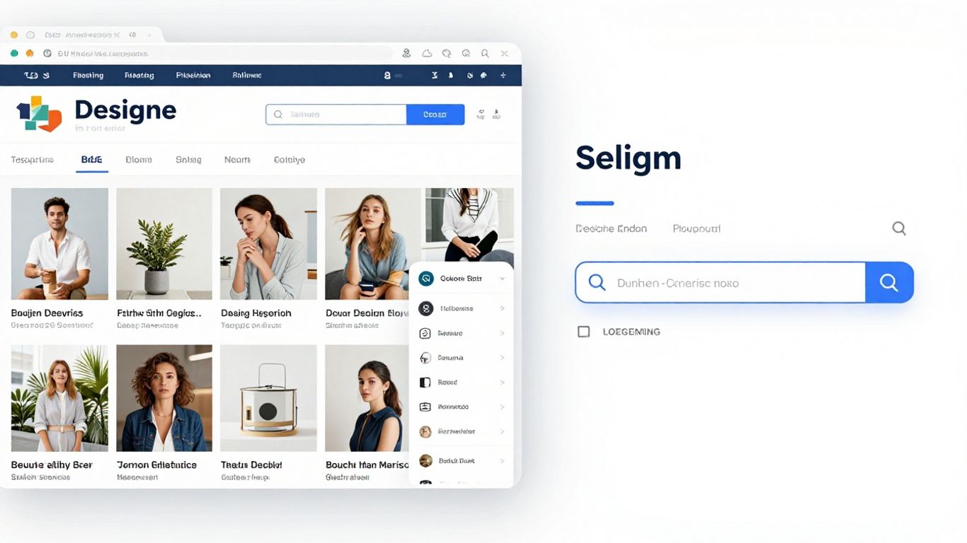
Minimalism is popular for a reason. It looks clean, modern, and sophisticated. But when designers strip away too much, they can also remove the very things search engines need to understand a page. Think about it: if navigation labels are just abstract icons or vague phrases, how is a search engine supposed to know what's on that page? Users struggle too, not knowing what to expect until they click. It's a trade-off where visual appeal comes at the cost of clear signals.
Abstract Navigation and Vague Page Titles
This is a big one. When navigation menus use terms like "Resources" or "Solutions" without any further context, it's tough for both users and bots. Similarly, page titles that are too generic, like "Home" or "About Us" for every single service page, don't tell search engines anything specific. This ambiguity means search engines can't confidently rank your content because they don't fully grasp its purpose or relevance. It's like trying to find a specific book in a library where all the spines are blank.
Overusing Interactive Elements
Interactive elements like sliders, accordions, and pop-ups can make a site feel dynamic and engaging. However, if crucial information is hidden behind these interactions, it's a missed opportunity. Search engines might not crawl or index content that's tucked away in an accordion that needs to be opened. Users might miss important details if they don't happen to click the right button. Important content should be readily visible, with interactions serving to explore rather than gate information.
When design choices prioritize how something looks without also considering how it's understood structurally, we create a disconnect. Search engines don't see the visual flow; they read the underlying code and structure. If that structure is obscured or lacks clear signposts like headings and descriptive links, search engines struggle to determine what's most important on the page. This isn't about making sites ugly; it's about making them clear for everyone, including the bots that help people find them. Modern web design is about solving problems, and clarity is a big part of that.
Structure Over Style: How Search Engines Interpret Design
It's easy to get caught up in how a website looks and feels. We spend hours tweaking fonts, choosing color palettes, and arranging elements to create a beautiful user experience. But here's the thing: search engines don't see your site the way you or your visitors do. They don't appreciate a perfectly balanced layout or a clever use of negative space. What they do care about is structure, clarity, and the signals that tell them what your content is all about.
Search Engines Read Structure, Not Visual Flow
Think of it like this: you might arrange your living room to look amazing, with artful throws and carefully placed decor. But if you were trying to explain where the light switch is to someone over the phone, you'd talk about its position relative to the doorframe, not its aesthetic harmony with the rug. Search engines are like that person on the phone. They need clear, structural cues.
- Headings (H1, H2, H3, etc.) tell search engines what's most important on a page. Using them correctly, in a logical order, is like giving clear directions.
- Content order matters. What appears first often carries more weight, both visually and structurally.
- Internal links help search engines understand how different pages on your site relate to each other.
When design choices obscure these structural elements – maybe a heading looks pretty but isn't coded as a heading, or important text is hidden in a way that search engines can't easily access – it creates confusion. It's like having a beautiful sign with illegible text.
Search engines rely on the underlying code and structure to understand a page's purpose and content hierarchy. Visual appeal is secondary to this structural interpretation. When design prioritizes aesthetics without reinforcing clear structural signals, search engine visibility can suffer without obvious cause.
Visual Hierarchy Versus Structural Hierarchy
This is where things get tricky. Designers often create a visual hierarchy – making the most important elements look the biggest or most prominent. But if that visual prominence isn't backed up by structural hierarchy (like proper heading tags), search engines get mixed signals. A big, bold piece of text that's just styled paragraph text won't carry the same SEO weight as an actual H1 tag. It's a disconnect that can quietly hurt your rankings. We want the visual flow to match the structural flow, so search engines can confidently interpret what's important.
Hidden Signals in Minimalist Design
Minimalist design is popular for a reason: it can look incredibly clean and sophisticated. But sometimes, in the pursuit of simplicity, designers remove elements that search engines actually rely on. Abstract navigation labels, vague page titles, or replacing text with images can make a site look sleek, but they reduce clarity for bots. If a search engine can't easily understand what a page is about or how it connects to other pages, it struggles to rank it effectively. It's not that minimalism is bad for SEO, but it needs to be done thoughtfully, preserving those structural signals. Prioritizing mobile-first design is also key here, as what works on a large screen might get lost on a smaller one if not structured properly.
Design Decisions That Shape Page Interpretation
Search engines don't see your website like you do. They don't appreciate a beautiful layout or a clever use of white space. What they do understand is structure, code, and the signals that tell them what your page is about. Every design choice you make, from the font you pick to how you arrange content, sends signals. Some signals help search engines understand your page's purpose, while others can confuse them, leading to lower visibility. It's not about making your site look ugly; it's about making sure the design supports clarity for both users and bots.
Layout's Influence on Information Weight
Think about how you scan a page. You probably look at the headings first, then maybe the first few sentences of each section. Search engines do something similar, but they rely on structural cues more heavily. When important information is buried deep within a page, or hidden behind interactive elements like accordions or sliders, search engines might not give it the weight it deserves. This can happen when designers prioritize a clean look by hiding content. The goal should be to make key information visible and easily understandable right from the start.
Here's how layout can affect perceived importance:
- Top of the page: Content here generally carries more weight. Search engines tend to process information from top to bottom.
- Headings and subheadings: These are clear signals of topic hierarchy. If they're styled purely for aesthetics and lose their structural meaning, search engines get confused.
- Visual vs. Structural Hierarchy: A visually appealing page might draw attention to certain elements, but if those elements aren't structurally marked as important (like using proper
<h2>or<h3>tags), search engines might miss the point.
Design choices that delay the explanation of a page's purpose can lead search engines to assign less relevance to that page. It's like telling a story but taking ages to get to the main point.
Navigation Design for Crawlability and Meaning
Your website's navigation is like a roadmap for both users and search engine crawlers. If your navigation is abstract, uses vague labels, or relies heavily on JavaScript that crawlers struggle to interpret, you're making it harder for search engines to find and understand all your content. Clear, descriptive navigation links help search engines understand the relationship between different pages and the overall structure of your site. This isn't just about making it easy for people to click around; it's about helping search engines index your site effectively.
Consider these points for better navigation:
- Descriptive Link Text: Instead of "Learn More," use "Learn More About Our SEO Services."
- Logical Structure: Organize pages in a way that makes sense, with clear parent-child relationships.
- Avoid Over-Reliance on JavaScript: While interactive menus can be nice, ensure there's a fallback or a sitemap that crawlers can easily access.
Page Flow and Its Impact on Indexing
How content flows on a page matters. Search engines read pages sequentially. If the initial content doesn't clearly state the page's topic, or if important keywords are pushed too far down the page, it can negatively impact how the page is indexed and ranked. Design choices that prioritize large, attention-grabbing visuals before any text, for example, can create a delay in conveying the page's core message. A well-designed page guides the user (and the crawler) logically from the main topic to supporting details, reinforcing the page's intent at every step.
The Impact of Mobile and Page Speed on SEO
Mobile-First Design's Role in Search Visibility
Okay, so let's talk about mobile. It's not just a trend anymore; it's how most people find things online. Google, for instance, looks at your website's mobile version first when deciding where to rank you. This means if your site looks great on a desktop but is a mess on a phone, your search ranking is going to take a hit. It’s like showing up to a party dressed for the wrong occasion. Designers need to think about how content stacks up, how navigation works, and if important stuff gets pushed way down the page on smaller screens. If search engines can't easily figure out what your page is about on mobile, they won't rank it well, plain and simple.
- Prioritize clear headings and logical content order on mobile.
- Ensure your site's purpose is obvious early on, without requiring excessive scrolling.
- Test your mobile navigation thoroughly; it should be intuitive and easy to use.
Page Speed as a Reflection of Design Choices
Page speed is another big one. How fast your pages load directly affects how long people stick around. If your site takes ages to load, users get frustrated and leave. Search engines notice this. Design choices play a huge role here. Think about those fancy animations, huge images, or really complex layouts. They might look cool, but they can really slow things down. It’s a trade-off that designers sometimes overlook, and it quietly hurts SEO. But here's the thing: you don't have to sacrifice good design for speed. It’s about making smart choices, like optimizing images and keeping animations purposeful, not just flashy. When your pages load quickly, people stay longer, and that's good news for your search rankings.
Fast loading times aren't just a technical requirement; they're a direct outcome of thoughtful design. When performance is considered from the start, it reinforces the quality of the user experience, signaling to search engines that your site is reliable and user-friendly.
Performance Signals Reinforcing Design Quality
Search engines see slow, clunky pages as a sign of user frustration, no matter how pretty they look. A design that feels smooth and quick makes interactions better, which search engines like. On the flip side, a design that causes friction, like slow loading or confusing navigation, sends negative signals. When your website performs well, it builds trust with users. They're more likely to stick around and come back. Search engines reward that trust. So, the way your site performs on mobile and how fast it loads really shows how good your design is, and that's something search engines understand clearly.
Here's a quick look at how speed impacts user behavior:
| Metric | Impact on User Retention |
|---|---|
| Load time < 2 sec | High retention |
| Load time 2-5 sec | Moderate retention |
| Load time > 5 sec | Low retention |
Common Design Mistakes That Quietly Hurt SEO

You know, sometimes the things that look great on the surface can actually cause problems underneath. It’s like having a really fancy car that keeps breaking down – looks good, but doesn't get you where you need to go. The same can happen with website design and SEO. Many designers focus on making things look pretty, which is totally fine, but they might miss some key things that search engines look at. These aren't usually big, obvious errors, but little things that add up and can really mess with your site's visibility over time.
Ignoring Accessibility Signals
This is a big one that people often overlook. When a website isn't easy for everyone to use, it's not just a bummer for some users; it's also a signal to search engines that your site might not be the best choice. Think about things like text that's too small to read easily, or color combinations that make it hard to see the words. These aren't just aesthetic choices; they directly impact how usable your site is. Search engines want to show users the best results, and sites that are difficult to access for anyone tend to get pushed down.
- Poor color contrast: Makes text hard to read, especially for people with visual impairments.
- Tiny font sizes: Forces users to zoom in, which is annoying and can disrupt page layout.
- Missing alternative text for images: Screen readers can't describe the image for visually impaired users, and search engines miss out on keyword context.
Making your site accessible isn't just about being nice; it's about making your content understandable and usable for the widest possible audience. This broad usability is something search engines notice and reward.
Designing Pages Without Intentional Roles
Imagine going to a library and all the books were just thrown together randomly. You'd have a hard time finding what you need, right? Websites can be like that if every page looks and feels the same. Designers sometimes treat all pages as if they have the same purpose. But a service page should feel different from a blog post or a contact page. When search engines can't tell what a page is for, they struggle to rank it properly. Giving each page a clear role, both visually and structurally, helps search engines understand its intent and relevance.
Redesigning Without SEO Awareness
Redesigns are exciting! You get a fresh new look. But sometimes, in the rush to make things look modern, important structural elements get lost. URLs might change without proper redirects, headings can disappear, or content gets reorganized in a way that breaks the flow. Search engines see these changes as a loss of information or relevance, and your rankings can take a nosedive, even if the new design looks amazing. It’s vital to plan redesigns with SEO in mind from the very beginning, preserving or even improving the underlying structure that search engines rely on.
| Design Change | Potential SEO Impact | Mitigation Strategy |
|---|---|---|
| URL Structure | Loss of link equity, indexing issues | Implement 301 redirects for all changed URLs |
| Heading Tags | Reduced content clarity, keyword signal loss | Ensure logical heading structure (H1, H2, etc.) is maintained |
| Content Reorganization | Disrupted user flow, keyword cannibalization | Map out content migration carefully, preserving topical relevance |
Aligning Design and SEO for Optimal Outcomes
It's easy to think of design and SEO as separate things, like two different languages spoken by different teams. But honestly, they're more like two sides of the same coin. Both are trying to make a website clear and easy to use, just in different ways. Design uses visuals to communicate, while SEO uses structure and words. When these two work together, the website just makes sense to everyone, including search engines. Problems pop up when design and SEO are treated like strangers.
Design Leads Experience, SEO Supports Interpretation
Design should always be the boss when it comes to how a site feels and looks. The way things are laid out, the colors, the spacing – that's what builds trust and makes people feel something. SEO shouldn't mess with that. Instead, SEO should quietly help search engines figure out what the page is about. Think of headings that clearly mark sections, page titles that explain the purpose, and links that show how pages connect. Good design already has these things. SEO just asks that designers use them on purpose. When design is in charge and SEO plays a supporting role, websites feel polished, not just stuffed with keywords. It's about making the user's journey smooth, and letting the structure help search engines understand that journey.
Collaboration to Prevent Visibility Gaps
Too often, SEO gets tacked on at the very end, after all the design decisions are made. That's a recipe for trouble because the site's structure might already be a mess. But when designers think about SEO right from the start, during the layout planning phase, things just naturally become clearer. Navigation labels stay descriptive, the flow of the page introduces context early on, and important messages get the structural weight they deserve. Collaboration doesn't mean stifling creativity. It means avoiding wasted effort and making sure the site can actually be found. It’s about building a solid foundation from the get-go, which is key for long-term growth.
Shared Principles for Stronger Website Performance
Designers and SEO folks actually share more common ground than they might think. Both value clarity, both care about hierarchy, and both should be thinking about accessibility. Readable text keeps people on the page longer. A logical layout makes it easy to scan. Clear labels help people understand what they're looking at. These choices make the user experience better, and guess what? They also help SEO. When designers intentionally apply these shared principles, the website's performance gets a boost without losing its unique style. It’s a win-win situation.
The goal isn't to make a website look like a generic template for the sake of search engines. It's about making sure the design choices that make a site look good also make it understandable and accessible to everyone, including the bots that crawl the web. This means thinking about how headings are used, how content is structured, and how easy it is for users to find what they need.
Here’s a quick look at how some design elements directly impact SEO:
- Clear Headings (H1, H2, H3): These aren't just for visual breaks; they tell search engines the main topics and subtopics of a page. Using them correctly gives content structure.
- Descriptive Navigation Labels: Instead of abstract terms, use labels that clearly state what a user will find on the linked page. This helps both users and search engines predict content.
- Logical Content Flow: The order in which information is presented matters. A natural progression helps search engines understand the relationships between different pieces of content on a page.
- Alt Text for Images: While primarily for accessibility, descriptive alt text also provides context to search engines about the image content, which can indirectly help with image search rankings.
User Experience and Its SEO Implications
It’s easy to get caught up in how a website looks, but what about how it feels to use? That's where user experience, or UX, comes in, and it’s way more important for SEO than you might think. Search engines are getting smarter, and they’re paying attention to how real people interact with your site. If users are happy, clicking around, and finding what they need, that sends good signals. If they’re confused, frustrated, or leaving quickly, that’s a bad sign.
Readability's Direct Effect on Engagement
Think about the last time you landed on a page with tiny text, weird fonts, or walls of unbroken paragraphs. Did you stick around? Probably not. Readability isn't just about making text look nice; it's about making it easy to consume. When text is hard to read, people skim less, or they just leave. Search engines notice these short visits and interpret them as dissatisfaction. Good typography, clear spacing, and well-structured content keep people engaged longer. This longer engagement tells search engines that your page is relevant and useful.
Interaction Design's Dual Role
Interactive elements, like accordions that hide content or fancy animations, can make a site feel dynamic. But they have a double edge. While they can sometimes improve usability, overdoing it can hide important information. Search engines might not fully understand content that's tucked away behind a click or hover. Users might also miss critical details if they don't interact with those elements. The key is to use interaction to add to the experience, not to gatekeep meaning. Important stuff should be visible by default.
Visual Hierarchy Guiding Engagement Signals
How you arrange elements on a page – the visual hierarchy – guides users. It tells them what to look at first, second, and so on. This isn't just for aesthetics; it directly influences how users engage with your content. A clear hierarchy helps users find what they're looking for faster, reducing frustration and encouraging them to explore further. This positive interaction, like spending more time on the page or clicking through to other sections, is a signal to search engines that your content is valuable and well-organized. It’s about making it easy for both people and bots to understand what’s most important.
When design choices directly shape how users behave – like how long they stay, what they click on, and how easily they find information – it creates a feedback loop. Search engines observe this behavior, and it can influence your site's ranking over time. It’s a constant conversation between how your site looks, how it works, and how search engines interpret that interaction.
Bringing It All Together
So, it turns out that what looks good on a screen isn't always what search engines like. We've talked about how things like headings, clear navigation, and even how fast a page loads can really make a difference. It’s not about making websites look boring; it’s about making them work better for everyone, including those bots crawling the web. When design and search engine needs line up, you get a site that’s not only pretty but also gets found. It’s a win-win, really.
Frequently Asked Questions
Does looking good automatically make a website rank higher in search results?
Not really. While a nice-looking website can make people want to stay longer, it doesn't automatically mean search engines like Google will show it to more people. Search engines care more about how clear and easy to understand your website's information is, and how well it works for users. Good design helps with these things, which in turn can help with search rankings.
Can a website look great but still have bad SEO?
Yes, it can! Sometimes, designers focus so much on making things look cool that they forget how search engines understand websites. If a website uses confusing labels for its menus, hides important text, or uses too many fancy animations, search engines might have trouble figuring out what the page is about. This can quietly hurt its chances of showing up in search results, even if it looks amazing.
Is it better to focus on SEO or graphic design for a website?
Both are super important! Think of it this way: SEO helps search engines understand what your website is about, and graphic design helps people enjoy and trust your website. If you have great SEO but a confusing design, people might find your site but leave quickly. If you have a beautiful design but no SEO, people might not find it at all. You need both to work well together for the best results.
How does changing a website's look affect its search ranking?
When you redesign a website, you might accidentally change its structure or how search engines see it. For example, if page addresses (URLs) change, or if headings disappear, search engines might think the page is less important. This can cause your website's ranking to drop, even if the new design looks better. It's important to be careful during redesigns to keep the good parts that search engines liked.
Can fancy interactive parts of a website be bad for SEO?
Yes, they can if they hide important information. Things like pop-up boxes, sliders, or menus that only appear when you hover over them can sometimes prevent search engines from seeing the content. Also, if users have to click a lot to find basic information, they might get frustrated. It's best to make sure the most important stuff is easy to see right away.
What should designers keep in mind about SEO when they're creating a website?
Designers should think about SEO as making sure the website is clear and easy for everyone to understand, not just about adding special keywords. This means using clear headings, making sure the navigation is easy to follow, and organizing content in a way that makes sense. When designers focus on making things clear and well-structured from the start, SEO usually follows naturally.


Comments
Post a Comment