Unveiling the Magic: Why Minimalist Website Design Works Wonders for SEO
So, you've built a website that looks pretty slick. It's got all the bells and whistles, right? But are people actually finding it? Or is it just sitting there, looking pretty but lost in the digital wilderness? If you're wondering why your site isn't showing up on Google's first page, it might be time to rethink your design. Turns out, making your website look good and making it work well for search engines are more connected than you think. We're going to talk about why minimalist website design works wonders for SEO.
Key Takeaways
- Keeping your website fast is super important. Big images and messy code can slow things down, making people leave and search engines unhappy. Using smaller images and clean code helps your site load quicker.
- Making it easy for people to find what they need on your site is a big deal. Simple menus and clear links help visitors stay longer and find information without getting frustrated.
- Less can be more when it comes to design. Lots of empty space and easy-to-read text make your content simpler to understand. This keeps people on your site and signals to search engines that your site is good.
- Search engines like Google need to understand what your website is about. Clean code helps them 'read' your site better, and using descriptive text for images helps them understand those too.
- Making your website look good and work well on phones, tablets, and computers is a must. Google pays attention to how well your site works on mobile devices, so it needs to be adaptable.
The Foundation Of A Fast And Functional Website
Think about the last time you clicked on a link and then just… waited. And waited. Chances are, you probably clicked away. That’s the power of a slow website. Building a site that loads quickly isn't just a nice-to-have; it's a must-have for keeping people around and for search engines to pay attention. It’s all about making things work well, right from the start.
Optimizing Images For Speed And Quality
Images can really make a website pop, but they can also be huge speed bumps if you’re not careful. You don’t want to sacrifice how good they look, but you also don’t want them to make your pages crawl. The goal is to find that sweet spot where images are sharp and appealing without bogging down your site.
Here are a few ways to get this right:
- Resize Properly: Don't upload a massive photo if it's only going to be displayed as a small thumbnail. Resize it to the dimensions it will actually be shown.
- Choose the Right Format: Use JPEGs for photos and PNGs if you need a transparent background. Each has its strengths.
- Compress Wisely: Tools exist that can shrink image file sizes without making them look blurry or pixelated. It’s like deflating a balloon just enough to make it easier to carry.
Leveraging Alt Text For Accessibility And SEO
Alt text, or alternative text, is that little bit of description you add to an image. It’s super important for a couple of reasons. First, if someone can’t see the image (maybe they’re using a screen reader or the image failed to load), the alt text tells them what it is. This makes your site usable for more people. Second, search engines read alt text. It helps them understand what your images are about, which can help your pages rank better. It’s a simple thing that makes a big difference for both users and search engine visibility.
Implementing Lazy Loading For Enhanced Performance
Lazy loading is a clever trick where images and other media on your page only load when they’re about to come into view as the user scrolls down. Instead of loading everything at once, which can take ages, it loads things piece by piece. This means your page loads much faster initially, giving visitors something to see right away. It’s a smart way to manage resources and make the user’s experience smoother.
Making your website fast and functional from the ground up is like building a house on a solid foundation. If the base is weak, everything else is at risk of falling apart. Speed and good performance are the bedrock of a positive user experience and strong search engine performance.
Streamlining User Journeys With Intuitive Navigation
Think about the last time you visited a website and couldn't find what you were looking for. Frustrating, right? That's exactly why making your website's navigation super clear and simple is so important. It's like giving your visitors a map and a compass so they can easily find their way around. When people can find what they need quickly, they're more likely to stick around and do what you want them to do, whether that's buying something or signing up for a newsletter.
Crafting Clear Pathways To Information
Your website's structure should make sense. Imagine walking into a store where everything is just piled up randomly. You'd probably leave pretty fast. The same goes for websites. You need to organize your content so it's easy to understand where things are. This means using clear labels for your pages and sections.
- Logical Grouping: Put related pages together. For example, all your product pages should be in one section, and your contact information should be easy to find.
- Clear Labels: Use simple, descriptive words for your menu items. Instead of "Resources," try "Blog" or "Help Articles" if that's what's there.
- Search Bar: For larger sites, a search bar is a lifesaver. It lets people type in exactly what they're looking for.
Enhancing Usability Through Simplified Menus
Menus can get complicated fast. If you have too many options, people get overwhelmed. Keeping your main menu short and sweet is usually the best approach. You can always have secondary menus or links within the content for less important pages.
A cluttered menu is like a confusing road sign. It makes people stop, scratch their head, and maybe even turn back. Simplicity here really pays off.
Guiding Visitors With Strategic Link Placement
Where you put your links matters. Internal links help search engines understand your site better and keep visitors engaged by showing them related content. Think about what a user might want to see next after reading a particular page. For instance, if someone is reading about a specific product, linking them to customer reviews or a "how-to" guide for that product makes a lot of sense. This kind of thoughtful linking helps people discover more content on your site, which is good for them and good for your SEO.
Here's a quick look at how different navigation styles can impact user experience:
| Navigation Style | Pros | Cons |
|---|---|---|
| Mega Menu | Shows many options at once | Can be overwhelming if not organized well |
| Simple Dropdown | Clean and easy to use | Might hide some options |
| Sidebar Menu | Good for lots of categories | Takes up screen space |
Making your website easy to get around isn't just about looking good; it's about making sure people can actually use your site without getting lost. This focus on user experience is a big part of why minimalist design works so well for search engines.
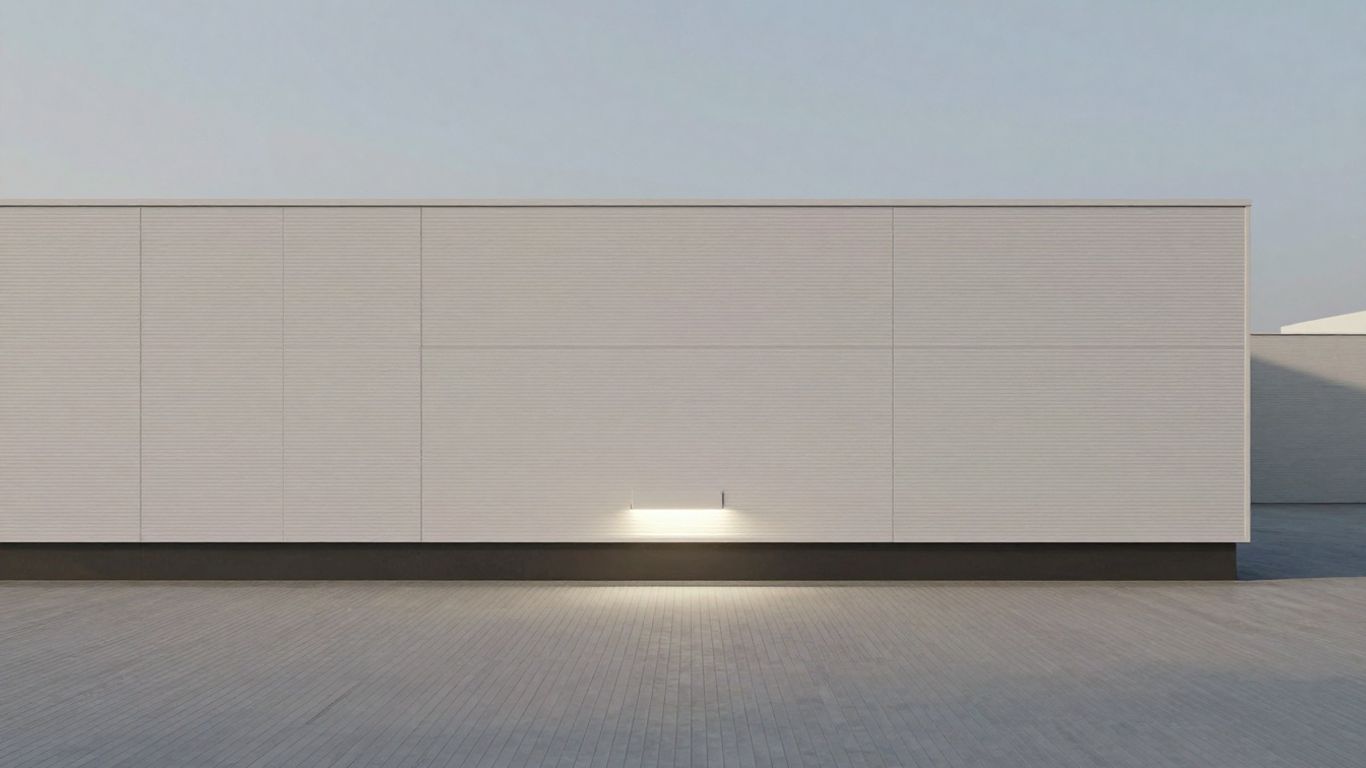
Embracing Minimalism For Enhanced Readability
Sometimes, less really is more. When it comes to making your website easy on the eyes and simple to understand, a minimalist approach can work wonders. It’s not just about looking clean; it’s about making sure people can actually read and use your site without getting overwhelmed. Think about it: when you land on a page that’s packed with text and flashing ads, do you stick around? Probably not. Minimalism cuts through that clutter.
The Power Of Whitespace In Design
Whitespace, often called negative space, is that empty area around and between elements on your page. It’s not wasted space; it’s a design tool. Proper use of whitespace makes your content easier to scan and digest. It helps guide the reader’s eye, making it clear where one section ends and another begins. This makes your pages feel less cramped and more inviting. It’s like giving your content room to breathe.
- Improves focus on key content.
- Reduces cognitive load for the user.
- Creates a sense of calm and professionalism.
Using whitespace effectively is like having a well-organized filing cabinet. Everything has its place, and you can find what you need without digging through piles of paper. This clarity translates directly to a better user experience, which search engines notice.
Choosing Legible Typography
Font choice matters a lot. You want fonts that are easy to read, whether someone is quickly scanning or reading a long article. Overly decorative or tiny fonts can be a real pain. Stick to clean, clear typefaces. Sans-serif fonts are often a good bet for web content because they tend to look sharp on screens. Think about font size too; making text too small is a common mistake that hurts readability.
Here’s a quick look at what makes a font good for the web:
- Clarity: Letters should be distinct from each other (e.g., 'i' vs. 'l').
- Size: Generally, 16px is a good starting point for body text.
- Line Height: Adequate spacing between lines of text (around 1.5 times the font size) is key.
Focusing On Essential Content Elements
Minimalism means stripping away anything that doesn’t serve a purpose. For your website, this means focusing only on the content that your visitors are looking for. Get rid of jargon, unnecessary graphics, or features that don't add real value. When your content is direct and to the point, users are more likely to find what they need and stay on your site longer. This focus also helps search engines understand what your page is about more clearly, which is great for web accessibility.
It’s about making sure that every word, every image, and every button has a reason to be there. If it’s just clutter, it’s got to go. This approach not only makes your site look better but also makes it perform better by keeping things simple and focused.
Boosting Search Engine Understanding With Clean Code
Think of your website's code like the engine of a car. You can have a flashy paint job and a comfortable interior, but if the engine is sputtering and full of junk, it's not going to perform well. Search engines feel the same way about your website. Messy, disorganized code makes it tough for them to figure out what your site is all about, which can really hurt your search rankings.
The Relationship Between Code and SEO
Clean code is basically well-organized instructions for your website. When your HTML, CSS, and JavaScript are tidy, search engine bots can crawl and understand your pages much faster. This means they can index your content more accurately and quickly. This efficiency directly translates into better visibility on search results pages. It's like giving Google a clear map instead of a crumpled, illegible mess. Less clutter in the code means less confusion for the bots.
Ensuring Efficient Site Crawling and Indexing
Search engines send out bots to explore the web. These bots follow links and read the code on each page. If your code is bloated with unnecessary elements, redundant tags, or excessive whitespace, it slows down this process. Imagine trying to read a book with pages stuck together – it's a pain. Clean code removes these obstacles, allowing bots to access and process your content without delay. This also helps with things like structured data and schema markup. When you use these to tell search engines about your content (like what a product is, or what an event is about), clean code makes sure that information is read correctly.
Here's a quick look at what makes code
Visual Hierarchy: Directing Attention For Better Engagement
Using Size and Color to Guide the Eye
Think about how you scan a page. Your eyes don't just wander randomly, right? They're drawn to certain things first. That's visual hierarchy in action. It's about making the most important stuff pop out. Big headlines grab attention first, then maybe a bolded sentence, and then the smaller text. Color plays a big part too. A bright button against a muted background? You're going to notice that. It's like a spotlight on your page, showing people exactly where to look.
- Headlines: Make them big and bold. They tell people what the page is about right away.
- Subheadings: Smaller than headlines, but still stand out from the main text.
- Key phrases: Use bolding or a different color sparingly to highlight important words or short sentences.
- Call-to-action buttons: These should be the most visually distinct elements on the page.
Strategic Placement of Key Elements
Where you put things on a page matters just as much as how they look. People tend to scan pages in a Z or F pattern. So, putting your most important information or your main call to action at the top left or center of the page makes sense. It’s about putting things where people are naturally looking. If you hide your contact form at the bottom of a super long page, chances are, most people won't even find it.
Good placement means users don't have to hunt for what they need. It feels natural and easy, which keeps them on your site longer.
Improving User Experience and Reducing Bounce Rates
When a website has a clear visual hierarchy, it's just easier to use. People can find what they're looking for quickly without getting frustrated. This makes them more likely to stick around, explore more pages, and maybe even do what you want them to do, like sign up or buy something. If a site is confusing or overwhelming, people just leave. That's a bounce, and too many bounces tell search engines your site isn't very good. So, making things clear visually helps keep people happy and search engines impressed.
Responsive Design For A Seamless Cross-Device Experience
Think about it: people check websites on all sorts of devices these days. Phones, tablets, big desktop monitors – you name it. If your site looks wonky or is hard to use on any of them, people will just leave. That's where responsive design comes in. It's basically making your website flexible, so it automatically adjusts to fit whatever screen it's being viewed on. This adaptability is key for keeping visitors happy and, you guessed it, for SEO.
Adapting To Mobile-First Indexing
Google now looks at the mobile version of your site first when deciding how to rank it. So, if your mobile site isn't up to par, your search rankings can take a hit. This means you really need to pay attention to how your site performs on smaller screens. Things like making sure buttons are easy to tap and that text is readable without zooming are super important. If your site is clunky on a phone, Google notices, and so do potential visitors.
Ensuring Visual Appeal Across All Devices
Responsive design isn't just about making things fit; it's about making them look good too. A site that looks great on a big screen might be a mess on a phone. Responsive design uses flexible grids and layouts to make sure your images, text, and other elements arrange themselves nicely, no matter the screen size. This means a consistent look and feel, which builds trust with your audience.
Maintaining Performance On Any Screen
When a website loads slowly, especially on a mobile device where people are often on the go, it's a major turn-off. Responsive design helps with this by allowing you to serve different versions of content or optimize images based on the device. This way, you're not bogging down a phone user with a huge desktop-sized image. It's all about giving everyone a fast, smooth experience.
Here's a quick rundown of what makes a site perform well across devices:
- Flexible Grids: Using percentages for widths instead of fixed pixels means your layout can stretch or shrink.
- Optimized Media: Serving appropriately sized images and videos for the device viewing them.
- Touch-Friendly Elements: Making sure buttons and links are large enough and spaced out for easy tapping.
- Minimal Pop-ups: Especially on mobile, intrusive pop-ups can really annoy users and hurt your site's usability.
A website that works well on a phone is just as important as one that works well on a computer. If it's difficult to use on one, people will likely go elsewhere. This directly impacts how long they stay on your site and whether they come back, which search engines pay attention to.
Making your website look great on any device is super important. Whether someone is on a phone, tablet, or computer, they should have a smooth experience. We help make sure your site works perfectly everywhere. Want to see how we can make your website shine on all screens? Visit our website today to learn more!
Wrapping It Up: Simplicity Wins
So, there you have it. We’ve talked a lot about how making your website clean and simple isn't just about looking good, though that's a big part of it. It actually helps people find you on Google. When your site loads fast, is easy to look around, and clearly shows what you offer, both visitors and search engines take notice. It’s not some complicated secret; it’s just smart design that makes sense for everyone. By focusing on what truly matters, you’re not just building a website, you’re building a better online presence that works harder for your business.
Frequently Asked Questions
What is minimalist website design?
Minimalist website design is like tidying up your room. It means using only the most important things and keeping the design simple and clean. Think lots of empty space, easy-to-read text, and not too many flashy pictures or buttons. It's about making things look good and easy to use without being cluttered.
How does a simple design help my website show up better on Google?
When your website is simple and loads fast, Google likes it more. If your site is easy for people to look around and find what they need, Google sees that people like your site. This can help your website rank higher in search results.
Why is having a fast website important for SEO?
Imagine waiting forever for a webpage to load. You'd probably leave, right? Google knows this. Websites that load quickly keep visitors happy and on the page longer. Google rewards faster sites with better rankings because it means a better experience for everyone.
What is 'whitespace' and why is it good for my website?
Whitespace is the empty space on your webpage, like the margins around text or the space between design elements. It's not wasted space! It helps make your content easier to read and understand, making your website feel less crowded and more professional. This helps visitors focus on what's important.
How does 'clean code' help my website's SEO?
Clean code is like having a well-organized toolbox. It makes it easier for search engines like Google to understand what your website is about. When Google can easily 'read' your site, it can rank it better. Plus, clean code often means your website loads faster, which Google also loves!
What is 'responsive design' and why does it matter for SEO?
Responsive design means your website looks good and works well on any device, whether it's a big computer screen, a tablet, or a small phone. Since many people use their phones to search online, Google pays attention to how well your site works on mobile. A responsive site gives everyone a good experience, which helps your SEO.


Comments
Post a Comment