Fonts, Flow, and Friction: The Subtle Design Elements That Elevate Websites from Good to Great
You know, it’s funny how much goes into making a website feel just right. We all notice when a site looks good, but have you ever thought about *why*? It’s not just about pretty pictures. A lot of it comes down to the tiny details, like the fonts you use and how the text flows. These little things, the ones you might not even consciously register, are actually what separate a site that’s just okay from one that really shines. We’re talking about Fonts, Flow, and Friction: The Weird Details That Separate Good Sites from Great Ones.
Key Takeaways
- Picking the right fonts makes your website easier to read and helps people trust your brand.
- Mixing font styles, like serif with sans-serif, can create a nice look if you do it right, but don't use too many.
- Using different text sizes and spacing helps guide people through your content, so they know what to look at first.
- The type of font you choose can change how people feel about your brand – think friendly, serious, or modern.
- Make sure your fonts look good and are easy to read on phones and tablets, not just on computers.
The Foundational Role of Typography in Web Design
When you're building a website, the words on the page are obviously important, but how those words look is just as big a deal. Seriously, the font you pick can totally change how someone feels about your site. It's not just about making things look pretty; it's about making them easy to read and understand. If people can't easily read your stuff, they're probably just going to leave. Some reports say that if a website's content looks bad, like 38% of people will just stop using it. That's a huge chunk of potential visitors gone because of something as simple as font choice.
Enhancing Readability and User Experience
Think about reading a book with tiny, weirdly shaped letters. It's a pain, right? Websites are the same. Good fonts make it easy for people to read your content without their eyes getting tired. This means they'll stick around longer and actually take in what you're trying to say. We're talking about things like making sure the letters are clear, the lines aren't too close together, and the text is a good size. It all adds up to a much better experience for whoever is visiting your site.
Establishing Brand Identity and Trust
Your font choice also says a lot about your brand. Is your brand supposed to feel modern and sleek? Or maybe more traditional and trustworthy? The font you use can communicate that without you having to say a word. If your website looks professional and well-put-together, people are more likely to trust you. It's like dressing well for a job interview – it makes a good first impression. A lot of people decide if they trust a company based on how their website looks, and the text is a big part of that.
Driving Conversions Through Clear Communication
And let's not forget about getting people to do what you want them to do, like signing up for a newsletter or buying something. If your calls to action or important information are hard to read, people won't click them. Using different font sizes and weights helps guide people's eyes to the most important parts of the page. It's like putting up signs that say "This way!" or "Important information here!" When the text is clear and guides the user, they're more likely to complete the actions you want them to.
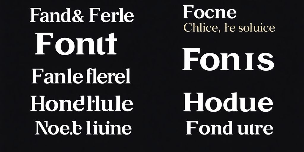
Mastering Font Pairings for Visual Harmony
Picking the right fonts for your website is a bit like choosing a dance partner. You want them to complement each other, not step on each other’s toes. Getting this right makes your site feel polished and professional. It’s not just about picking pretty letters; it’s about creating a visual rhythm that guides people through your content.
Leveraging Contrast for Distinct Personalities
Think about pairing a classic serif font, like Merriweather, with a clean sans-serif, such as Open Sans. The serif brings a bit of tradition and readability, especially for longer text blocks, while the sans-serif offers a modern, crisp feel, perfect for headings or calls to action. This contrast helps define different types of information at a glance. It’s like giving your content different voices – one might be the authoritative narrator, the other the friendly guide. Just don't go overboard; too many contrasting styles can make your site look messy.
Ensuring Similar Proportions for Cohesion
Even when you’re mixing font styles, paying attention to their proportions is key. Fonts with similar 'x-heights' – that’s the height of lowercase letters like 'x' – tend to look good together. If one font’s lowercase letters are much taller or shorter than another’s, it can throw off the visual balance. For example, pairing fonts that have a similar feel in their lowercase forms helps them sit nicely side-by-side, even if one is a serif and the other a sans-serif. It creates a subtle harmony that makes the whole design feel more unified. You can often find good pairings on sites like Google Fonts, which sometimes suggest combinations that work well together.
Limiting Font Families for Clarity
It might be tempting to use a whole alphabet soup of fonts, but resist the urge. Sticking to two or three font families at most is usually the best approach. This keeps your design from looking cluttered and makes it easier for visitors to focus on what you’re saying. A common strategy is to pick one font for headings and another for body text. You might use a third, perhaps a display font, for special accents or calls to action, but use it sparingly. This focused approach makes your website feel more intentional and professional, much like a designer who knows how to use advanced tools like InDesign for greater control over typography.
Too many font choices can confuse your audience and make your website feel less trustworthy. Simplicity often wins.
When you limit your font selection, you create a consistent visual language. This consistency helps build brand recognition and makes your website feel more reliable. It’s about creating a clear hierarchy and a pleasant reading experience, ensuring that your message comes across loud and clear without unnecessary visual distractions.
Crafting Hierarchy to Guide the Reader's Eye
You know, when you land on a website, your eyes don't just wander randomly. They're actually guided, and that's where typographic hierarchy comes in. It’s all about making certain bits of text pop more than others, so people know what to read first, second, and so on. Think of it like a visual roadmap for your content. Without it, a page can feel like a jumbled mess, and nobody wants that.
Utilizing Size and Weight for Emphasis
This is probably the most straightforward way to build hierarchy. Bigger text naturally grabs attention. So, your main headings should be the largest, followed by subheadings, and then your regular body text. It’s like shouting versus whispering. Using different font weights, like bold for important phrases or section titles, also makes them stand out. It’s not just about making things bigger; it’s about giving them visual importance. For instance, a bolded call-to-action button text will get noticed way more than the regular text around it. It’s a simple trick, but it works wonders for directing attention.
Employing Spacing to Differentiate Content
Spacing is another quiet hero in creating hierarchy. Think about the space around your text. More space around a heading makes it feel more important and separates it from the paragraph below. This is often called “white space,” but it doesn’t have to be white; it’s just the empty area. When you have a lot of text, using generous line spacing (the space between lines of text) makes it easier to read and helps the eye flow smoothly. Too little space, and it feels cramped and hard to follow. Proper spacing between paragraphs also helps break up content, making it less intimidating and easier to digest. It’s like giving each piece of text its own little breathing room.
Strategic Use of Color to Enhance Text
Color is a powerful tool, and when used with typography, it can really guide the reader. You can use color to highlight key information, like a special offer or an important statistic. However, you have to be careful not to overdo it. Too many colors can be distracting and make the hierarchy confusing. A good rule of thumb is to use color sparingly for emphasis. For example, a call-to-action button might be a bright color that stands out from the rest of the page, drawing the user’s eye directly to it. It’s about making specific elements pop without overwhelming the overall design. Remember, contrast is key here; make sure your colored text is still readable against its background. Developers often use color to signal interactive elements, which is a smart way to guide user interaction on a page. This helps with user flow.
Creating a clear visual path for your readers is not just about making things look pretty; it's about making your website functional and easy to use. When people can quickly find what they're looking for, they're more likely to stick around and engage with your content. It’s a subtle art, but getting it right makes a huge difference in how effective your website is.
Font Psychology: Shaping Perception and Emotion
It’s pretty wild how much a font can actually change how someone feels about your website, right? It’s not just about looking pretty; it’s about sending a message, even before someone reads a single word. Think about it – a super formal font might make a company seem really serious and trustworthy, maybe for a law firm or a bank. On the flip side, a bubbly, rounded font could make a kids’ toy store feel way more fun and approachable. It’s all about setting the right tone.
The Emotional Impact of Font Styles
Different font styles really do tap into different emotions. Sans-serif fonts, with their clean lines and lack of little feet (serifs), often come across as modern, straightforward, and even a bit minimalist. They’re great for tech companies or brands that want to feel current and efficient. Serif fonts, on the other hand, with those classic little strokes, tend to feel more traditional, established, and sometimes even a bit academic or literary. They can give a sense of history and reliability. Then you have display fonts, which are usually for headlines – they’re meant to grab attention and can be really artistic or quirky, but you wouldn’t want to read a whole book in them. It’s like choosing the right outfit for the occasion; the font needs to match the vibe you’re going for.
Building Authority with Classic Serif Fonts
When you want your website to feel solid, dependable, and like it really knows its stuff, serif fonts are often the way to go. Think about newspapers or old books – they use serifs to feel authoritative and trustworthy. For businesses in fields like finance, law, or even academia, using a well-chosen serif font can subtly communicate that you’re established, credible, and have a long-standing reputation. It’s a visual cue that says, “We’re serious about what we do.” It’s interesting how these little design choices can build up that sense of trust without you even realizing it. A lot of people judge a company’s credibility based on its website design, and typography plays a big part in that initial impression.
Conveying Modernity with Sans-Serif Choices
Sans-serif fonts are the go-to for a lot of modern websites, especially those in the tech world or aiming for a clean, minimalist aesthetic. They just look so straightforward and uncluttered. Fonts like Open Sans or Lato feel very current and accessible. They don’t have any extra flourishes, which can make them feel very efficient and easy to read, particularly on screens. If your brand is about innovation, speed, or a fresh approach, sans-serifs are usually a safe and effective bet. They help create a user experience that feels clean and direct, which is often what people expect from digital platforms today. It’s a simple way to signal that your brand is up-to-date and forward-thinking, which can be really important for attracting a certain audience. Making sure your site is discoverable is also key, and good SEO practices help with that.
Optimizing Fonts for Mobile Responsiveness
When folks visit your website on their phones, the way text looks and feels can make or break their experience. It’s not just about making things fit; it’s about making them easy to read and pleasant to look at, even when the screen is tiny. Think about it: if you can’t easily read the words, you’re probably not sticking around.
Adjusting Line Height for Legibility
Line height, or leading, is super important for making text easy on the eyes, especially on smaller screens. When lines of text are too close together, it’s hard for your eyes to jump from the end of one line to the beginning of the next. This can make reading feel like a chore.
- Aim for a line height of at least 1.5. This means the space between lines is about one and a half times the size of the font itself. It gives each line enough breathing room.
- Consider the font itself. Some fonts naturally have more space between their letters or ascenders/descenders (the parts of letters that go up or down). You might need to tweak the line height slightly based on the specific font you’re using.
- Test it out. What looks good on a desktop might feel cramped on a phone. Always check your line height on a mobile device to make sure it’s comfortable.
Good line spacing helps guide the reader's eye smoothly from one line to the next, reducing the effort needed to process the text. It’s a small detail that makes a big difference in how long someone will actually read your content.
Experimenting with Font Weights on Smaller Screens
Font weights (like regular, bold, light) are great for creating visual contrast and hierarchy. But on mobile, you have to be a bit more careful. Really thin font weights can disappear or become unreadable on small, high-resolution screens, especially if the contrast isn't perfect. On the flip side, using too many different weights can slow down your site, which is a big no-no for mobile users who are often on slower connections.
- Stick to a few key weights. Usually, a regular and a bold is enough for most body text and headings. Maybe a semi-bold for subheadings if you need it.
- Avoid ultra-light or very thin weights for body text. These are often the first to cause readability issues on mobile.
- Use bold sparingly for emphasis. Overusing bold can make the text look cluttered and defeat its purpose.
Ensuring Consistent Display Across Devices
What looks perfect on your big monitor might look totally different on someone’s phone. This is where responsive design comes in, and fonts are a big part of that. You want your text to look good and be readable no matter the screen size or device.
- Use relative units like
remoremfor font sizes. Unlike fixed pixels (px), these units scale based on the user’s browser settings or the parent element’s font size, making them more flexible. - Test on actual devices. Emulators are helpful, but nothing beats checking your site on a real iPhone or Android phone. See how the text reflows and if anything gets cut off or looks weird.
- Consider font loading. Make sure your fonts load quickly. Slow-loading fonts can cause a flash of unstyled text (FOUT) or make your page feel sluggish, which is especially noticeable on mobile.
Beyond Aesthetics: Typography's Impact on Performance

It's easy to get lost in how pretty fonts look, but what about how they actually work? Turns out, the fonts you pick can seriously mess with how fast your website loads and how smoothly it runs. Slow-loading fonts are a major drag on user experience and can even hurt your search engine rankings. Think about it: if your site takes ages to show text, people are just going to leave. It’s like showing up to a party and the host takes forever to open the door – you’re probably just going to go somewhere else.
The Role of Font Loading Speed
When a browser loads a webpage, it needs to download all the necessary files, including font files. If these files are large or if there are too many of them, it can significantly delay when the text actually appears on screen. This is often called the "flash of invisible text" (FOIT) or "flash of unstyled text" (FOUT). Users see a blank space where the text should be, or sometimes the text appears in a basic fallback font before the chosen font loads. This delay isn't just annoying; it directly impacts how quickly users can start reading your content. Studies show that a delay of even a few seconds can lead to a big drop in user engagement. For instance, a 10% increase in page load time can result in a 7% decrease in conversions. That's a pretty big hit just from font choices.
How Managed Hosting Optimizes Font Delivery
Managed hosting providers often have systems in place to help speed up font delivery. They might use techniques like font subsetting, where only the characters you actually need from a font file are included, making the file smaller. They can also implement caching, so if a user has visited your site before, their browser already has the font files stored and doesn't need to download them again. Some hosts also use Content Delivery Networks (CDNs) which store copies of your font files on servers all over the world, so users download them from a server that's geographically closer to them. This all adds up to faster loading times. Choosing a good managed web hosting service can make a noticeable difference here.
Choosing Fonts That Balance Style and Function
So, how do you pick fonts that look good without tanking your site's performance? It's all about finding that sweet spot. Generally, simpler font files are smaller and load faster. Web fonts, especially those with lots of weights and styles, can be quite large. You might want to consider using system fonts for some elements, as they're already on the user's device and load instantly. If you do use web fonts, try to limit the number of font families and weights you use. For example, sticking to just regular and bold versions of one or two font families is usually a safe bet. Also, look for fonts that are optimized for the web. Some font foundries offer specific "web" versions of their fonts that are designed to be smaller and load more efficiently. It’s a bit of a balancing act, but getting it right means your site will be both visually appealing and lightning fast.
Typography is more than just how words look; it can actually make your website work better. Choosing the right fonts can help people understand your content faster and keep them engaged longer. It's a key part of making your site user-friendly and effective. Want to see how good design can boost your site's performance? Visit our website to learn more!
Putting It All Together
So, we've talked a lot about fonts and how they can really change how people feel about a website. It’s not just about picking something that looks nice; it’s about making sure people can actually read it easily, whether they’re on their phone or a big computer screen. Good font choices help guide people through the page, making them more likely to stick around and do what you want them to do, like signing up or buying something. It’s the little things, like the space between lines or how bold a headline is, that make a big difference. When you get these details right, your website just feels better to use, and that’s what turns a so-so site into a really good one.
Frequently Asked Questions
Why is choosing the right font so important for websites?
Picking the right font is super important for websites! It makes sure people can read your words easily, helps them understand what your brand is about, and can even get them to click on buttons. Think of it like choosing the perfect voice for your website.
How many different font styles should I use on my website?
It's best to stick to just two or three different font styles. Usually, one for big titles and another for the main text works well. Using too many fonts can make your website look messy and confusing for visitors.
Are Google Fonts good for website speed and performance?
Yes, Google Fonts are a great choice! They are made to load fast, are easy for everyone to read, and work well on all sorts of devices. Plus, they are free and simple to add to your site.
How can I find font combinations that look good together?
To pick fonts that look good together, try mixing a font with a strong personality, like a fancy serif font for titles, with a simpler, clean font like a sans-serif for the main text. Websites like Google Fonts even give you ideas for good pairings.
What's the best font size and spacing for website text?
For the main text on your website, aim for a font size of at least 16 pixels. Then, make your headings bigger so they stand out. It's also important to have enough space between lines of text so it's easy to read, especially on phones.
How do font styles affect how people feel about a website or brand?
Fonts can change how people feel about your brand. Friendly, rounded fonts can make your brand seem approachable, while sharp, modern fonts might make it seem high-tech or serious. The fonts you choose send a message about who you are.


Comments
Post a Comment