Why Every Business Needs a Website Designed Around Its Customers

Key Takeaways
A customer-centered website makes it easier for the right people to understand, trust, and choose a business.
- Start with customer questions, needs, and motivations.
- Organize pages around real journeys rather than internal departments.
- Make every important interaction clear, accessible, and usable on mobile.
- Connect helpful content with sound technical SEO practices.
- Measure behavior, listen to customers, and keep improving.
What customer-centered website design means for modern businesses
A website should do more than announce that a business exists. It should help visitors decide what to do next, whether that means comparing options, asking a question, booking a service, or making a purchase. Customer-centered design treats those needs as the starting point. The result is usually a clearer experience for visitors and a more useful business asset.
Moving beyond business-first messaging
Business-first websites often lead with internal language: awards, departments, features, and broad claims. Those details can matter, but they rarely answer the visitor’s first concern: “Can this business help with my particular problem?” Customer-centered messaging puts the problem, desired outcome, and practical next step closer to the front of the page.
A useful rewrite replaces vague statements with concrete guidance. Rather than describing a company as “committed to excellence,” explain who it serves, what it helps with, and what a visitor can expect after reaching out. Clarity earns attention because it reduces the work required to understand the offer.
Connecting website goals to customer needs
A business may want more leads, sales, appointments, or newsletter signups. Those goals are valid, but they become more effective when translated into customer actions. A lead goal might mean making service comparisons easier; a sales goal might mean answering delivery and pricing questions before checkout.
This connection also helps teams choose what belongs on a page. Every section should support a question, concern, or decision. If a piece of content does not help visitors understand the offer or move forward, it may belong somewhere else—or not belong at all.
Balancing brand identity with usability
A recognizable visual identity can make a site feel credible and distinct. It should not make the navigation mysterious or force visitors to decode stylized labels. Color, type, imagery, and tone work best when they reinforce a structure people can use without instruction.
The balance is straightforward: express personality through the presentation, while keeping the underlying experience familiar. Clear headings, readable contrast, predictable buttons, and descriptive links give the brand room to be memorable without becoming difficult to operate.
Recognizing different customer journeys
Not every visitor arrives with the same level of knowledge or urgency. Someone discovering a problem needs education, while someone comparing providers may need proof, pricing context, and a direct way to ask for details. Returning customers may want a shortcut to support or account information.
Mapping these paths prevents a site from treating every visitor as if they are ready for the same action. It also encourages useful secondary calls to action, such as reading a guide, viewing examples, or contacting a specialist before making a commitment.
How customer research shapes a more effective website
Good design begins before layouts are drawn. Research reveals the language customers use, the objections they carry, and the moments when they need reassurance. It can come from interviews, support conversations, sales calls, reviews, search data, and direct observation. The goal is not to collect research for its own sake, but to turn it into better decisions.

Identifying audience segments and buying motivations
Audience segments should reflect meaningful differences in needs, not simply convenient demographic labels. A first-time buyer, a returning client, and a procurement manager may all seek the same service but evaluate it differently. Their concerns, vocabulary, and preferred evidence can vary considerably.
Research helps a team understand what each group is trying to accomplish. It also shows which motivations are practical, emotional, or risk-related. Those insights can shape page priorities, examples, navigation labels, and the order in which information appears.
Using search intent to understand customer questions
Search queries often reveal a visitor’s stage of decision-making. A broad educational query suggests that the person is learning, while a service-specific query may indicate a stronger need and a shorter path to contact. The website should respond to both without treating them as interchangeable.
Instead of forcing every visitor onto a sales page, create useful answers that lead naturally toward relevant services. Search intent can guide titles, headings, internal links, and calls to action while keeping the content grounded in what people actually want to know.
Mapping pain points across the decision process
A customer’s difficulty may begin before they visit the site. They may be unsure which service fits, worried about cost, uncertain about timing, or skeptical of unfamiliar claims. A journey map makes those concerns visible at each stage, from initial research through inquiry and follow-up.
Once the pain points are listed, the team can match them to practical content. An explainer may resolve confusion, a comparison may support evaluation, and a transparent process page may reduce anxiety before contact. This is more useful than adding pages simply because a competitor has them.
Turning customer feedback into design priorities
Feedback becomes valuable when it is specific enough to influence a decision. Comments such as “I could not find the price range” or “I did not know what happened after submitting the form” point to clear improvements. Repeated questions from sales and support teams can reveal the same gaps from another angle.
A simple priority system can keep feedback from becoming an endless wish list. Teams can group findings by frequency, customer impact, effort, and business relevance, then address the issues that create the most friction first.
How user experience turns visits into business results
A polished website is not automatically an effective one. Visitors need to recognize where they are, understand what is available, and feel confident taking the next step. User experience connects those moments into a path that feels natural rather than forced. Small improvements in structure and wording can have a meaningful effect on whether people continue.
Creating clear navigation and page structure
Navigation should reflect how customers think about the business. Labels such as Services, Pricing, About, Resources, and Contact are often more useful than clever alternatives that require interpretation. A well-structured page then carries that clarity through scannable headings, concise sections, and descriptive links.
The most important information should not be buried beneath a wall of introductory copy. Visitors should be able to identify the offer, its relevance, supporting evidence, and next step with a quick pass through the page.
Writing calls to action that match customer readiness
A call to action should tell visitors what will happen next and suit their level of commitment. “Buy now” may be appropriate for a familiar, low-risk purchase, but an uncertain prospect may respond better to “See how it works,” “Compare services,” or “Talk with the team.”
The surrounding copy matters as much as the button label. Explain the value of the action, set expectations about timing, and avoid placing several competing primary actions beside one another. Visitors should feel guided, not cornered.
Reducing friction in forms, checkout, and inquiries
Forms often ask for information the business wants rather than information needed to begin the conversation. Removing unnecessary fields, explaining required details, and making errors easy to correct can make the process feel considerably lighter. The same principle applies to checkout, scheduling, and account creation.
Teams should also review what happens after submission. A clear confirmation, useful next-step information, and a realistic response expectation reassure people that their request went somewhere. These details are part of the experience, not administrative leftovers.
Designing helpful landing pages for key services
A service landing page should stand on its own for a visitor who arrives from search, an email, or a referral. It needs enough context to explain the service, enough evidence to establish credibility, and enough direction to make the next action obvious.
A practical landing-page sequence often includes the customer problem, the service approach, relevant proof, common questions, and a clear contact option. The exact order can vary, but every section should earn its place by helping the visitor decide.
Why accessibility, mobile usability, and trust matter
Customer-centered design includes people using different devices, abilities, connection speeds, and levels of familiarity. A site that works only for a narrow group is leaving useful conversations behind. Accessibility and performance are also signs of respect: they show that the business has considered the conditions in which people actually browse. Trust then grows from the accuracy and care of the whole experience.
Making the site usable on every screen size
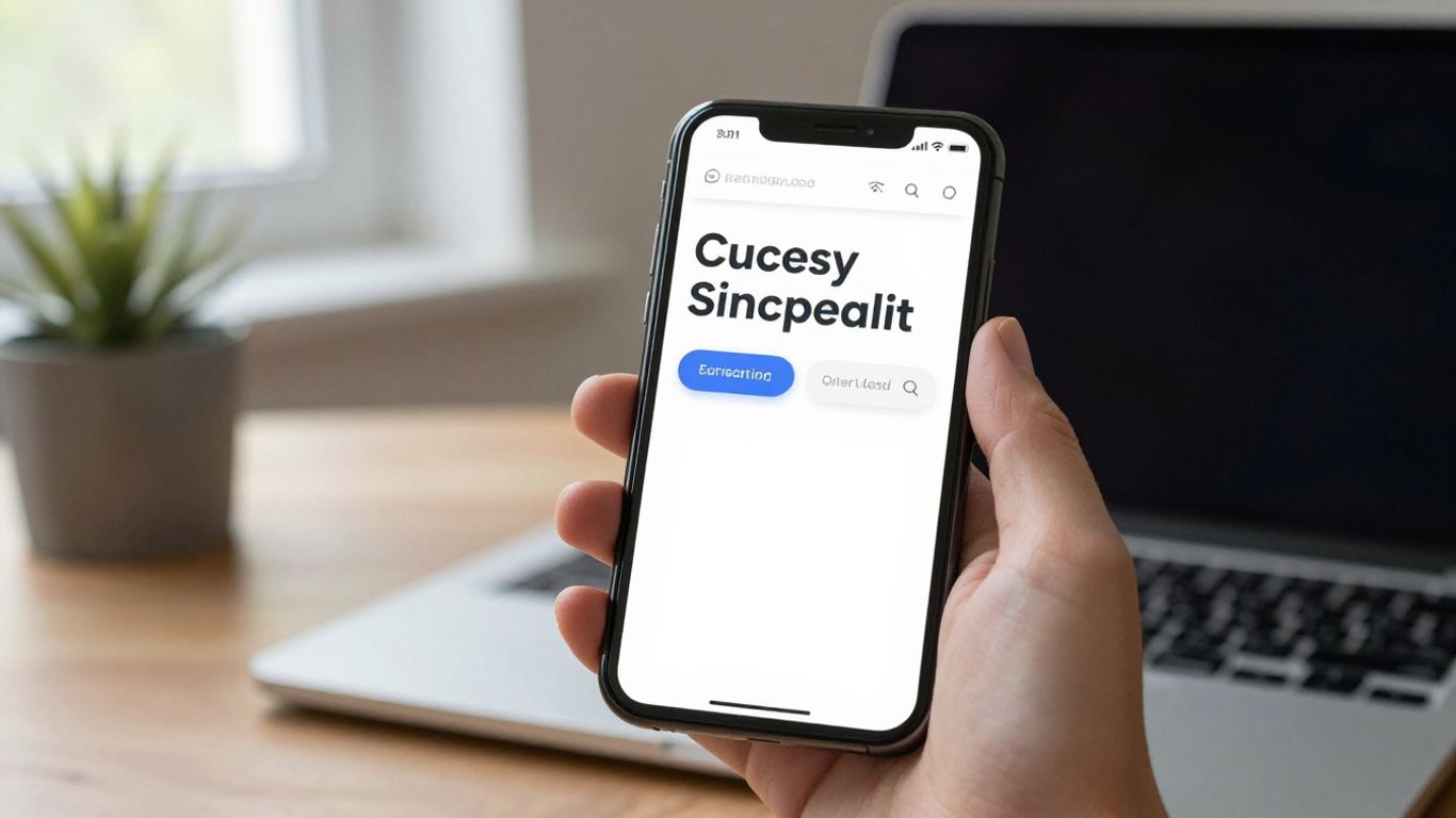
Responsive layouts should preserve meaning, not merely shrink desktop pages. On a phone, navigation, buttons, forms, images, and tables need to remain easy to use without excessive zooming or sideways scrolling. Touch targets should have enough space, and important actions should remain visible without overwhelming the screen.
Testing on real devices can reveal problems that a desktop browser window hides. A page may technically resize while still presenting tiny text, awkward menus, or a form that is difficult to complete with one hand.
Improving accessibility for a wider audience
Accessibility is built through many practical choices: sufficient color contrast, meaningful heading order, descriptive alternative text, keyboard support, captions where needed, and labels that work with assistive technology. These choices help people with disabilities and often make the site easier for everyone.
The strongest process includes accessibility from planning through testing. Treating it as a final inspection can leave structural problems that are more expensive and disruptive to fix later.
Using speed and performance to prevent abandonment
Slow pages interrupt attention before a visitor has understood the offer. Large media files, unnecessary scripts, weak hosting decisions, and poorly configured third-party tools can all contribute to delays. Performance work should focus on the pages and interactions that matter most to customers.
It helps to measure actual page behavior, then improve the largest sources of delay. A faster experience supports mobile users in particular, but it also makes the site feel more deliberate and dependable on every connection.
Building trust with reviews, policies, and clear contact details
Trust is easier to build when visitors can verify what they are being told. Reviews, case examples, transparent policies, business details, and clear contact options give people ways to assess the relationship before they commit. Evidence should be specific and current rather than inflated.
The same standard applies to limitations and expectations. Honest information about timelines, returns, service areas, or response times may reduce short-term clicks, but it creates better-informed inquiries and fewer unpleasant surprises.
How customer-focused design supports SEO visibility
Search visibility and customer experience are closely related, though they are not identical. Search engines need to understand a site’s pages, while people need those pages to answer real questions. A useful structure serves both purposes without turning the writing into a collection of keywords. Strong SEO services connect search visibility with qualified traffic, clear website structure, and customer needs.
Matching content to search intent
Content should answer the question implied by a search, not merely repeat the phrase that brought someone to the page. An informational query deserves a useful explanation; a comparison query needs distinctions and evidence; a service query should make the offering and next step clear.
This approach improves relevance because the content reflects the visitor’s purpose. It also creates a more natural internal journey from education to evaluation and, when appropriate, inquiry.
Organizing pages around services and customer questions
A logical site architecture gives each important topic a clear home. Core service pages can explain offerings, while supporting articles answer related questions and link back to the most relevant service. This avoids forcing one page to rank for every possible need.
Page titles, headings, internal links, and navigation should reinforce the same structure. When they do, visitors and crawlers can more easily understand how the information fits together.
Strengthening local SEO signals for nearby customers
Local customers often need practical details quickly: service areas, hours, contact information, directions, and evidence that the business serves people like them. Those details should be accurate and consistent across the website and relevant business profiles.
Local content also needs restraint. Mentioning a place only to insert a location term rarely helps anyone. Explain the actual service context for that area, and make the contact path easy to find.
Working with an SEO marketing company on technical improvements
A business may have strong customer knowledge but limited time for technical audits, structured page improvements, internal linking, and ongoing measurement. An SEO marketing company can support that work when its recommendations remain tied to customer intent and the site’s actual goals.
Ongoing SEO work is especially useful when search behavior, site content, and technical conditions change over time. The relationship should produce understandable priorities, not a stream of unexplained tasks. Technical improvements matter most when they make important pages easier to find, understand, and use.
How to measure whether the website serves customers well
Measurement should answer more than whether traffic went up. A customer-centered site is doing its job when the right visitors can find relevant information, complete important tasks, and move forward with fewer obstacles. The right metrics depend on the business model, but the principle is consistent: measure behavior alongside outcomes. Numbers become useful when they lead to a decision.
Tracking engagement and conversion KPIs
Useful measures may include qualified inquiries, completed purchases, appointment requests, downloads, assisted conversions, and calls from key pages. Engagement metrics such as meaningful scroll depth, return visits, and time spent with important content can add context, but they should not replace business outcomes.
Before tracking begins, define what counts as a valuable action. A long visit is not necessarily positive if the visitor was searching unsuccessfully for basic information.
Using analytics to identify drop-off points
A funnel can show where people stop progressing, but it cannot always explain why. A high exit rate on a service page may reflect poor messaging, missing information, slow loading, or simply that the page answered the visitor’s question. Interpretation requires context.
Review paths, device types, traffic sources, and page speed together. Patterns across those dimensions are more informative than a single percentage viewed in isolation.
Testing page layouts, messaging, and calls to action
Testing works best when it addresses a clear question. A team might compare a shorter form with a longer one, a direct service headline with an educational headline, or a single primary call to action with a softer secondary option. Each test should have a defined audience and success measure.
Not every result will be decisive, and not every winning variation will apply everywhere. Treat tests as evidence for a particular situation, then continue learning rather than turning one result into a permanent rule.
Combining quantitative data with customer feedback
Analytics can show that visitors abandon a form, while interviews or support records may explain that the form asks for confusing information. Surveys, usability sessions, sales notes, and customer service conversations add the human context that dashboards lack.
A regular review can bring these sources together. When a behavioral pattern and a customer comment point to the same obstacle, the case for a focused improvement becomes much stronger.
How to build and maintain a customer-centered website
Customer-centered design is not a one-time launch exercise. Content changes, services evolve, devices shift, and customer expectations move with them. The website needs an operating process that preserves its usefulness after the original project ends. That process can be simple, but it must have clear ownership.
Choosing the right content management and technology stack
Technology should fit the team’s capabilities and the website’s real requirements. A platform that is flexible but difficult to update may create delays, while a simple system may be the better choice if it supports secure publishing, useful integrations, performance, and accessibility.
Teams should evaluate maintenance needs before selecting tools. Consider who will publish, who will manage updates, how changes are reviewed, and what happens when a feature or integration becomes outdated.
Creating a sustainable content update process
Content stays useful when someone is responsible for reviewing it. Set intervals for checking service details, prices, policies, staff information, examples, and high-traffic educational pages. Updates should also be triggered by changes in the business, not only by a calendar.
A lightweight editorial workflow can include a content owner, a fact-checking step, an accessibility check, and a review of links and calls to action. Consistency matters more than a complicated approval chain.
Coordinating designers, developers, marketers, and sales teams
Each team sees different parts of the customer experience. Sales hears objections, support sees recurring problems, marketers study demand, designers shape comprehension, and developers manage the technical foundation. Regular collaboration prevents the website from reflecting only one department’s priorities.
A shared list of customer issues can make those conversations practical. It gives teams a common reference point and helps connect design changes to questions people are actually asking.
Prioritizing improvements as customer expectations change
Not every requested improvement deserves immediate attention. Prioritize work by customer impact, reach, effort, risk, and connection to business goals. A small fix to a high-traffic form may deserve attention before a large redesign of a rarely visited page.
Review priorities after launches, significant feedback, and changes in the market or service offering. A website remains customer-centered when it keeps responding to evidence instead of assuming that the original design will stay right forever.
Conclusion
A website designed around its customers is clearer about whom it serves, more considerate in how it guides people, and more disciplined about learning from behavior. Research shapes the structure, accessibility and trust support confidence, and ongoing measurement keeps the experience useful. Businesses ready to improve their website design, development, or SEO services can request a quote and begin with the customer problems that matter most.
Frequently Asked Questions
What is customer-centered website design?
Customer-centered website design organizes content, navigation, and interactions around visitors’ needs, questions, abilities, and decision-making stages rather than the internal structure of the business.
Why is customer research useful before redesigning a website?
Research reveals the language customers use, the concerns that slow decisions, and the information they expect. Those findings help teams solve real problems instead of relying only on internal assumptions.
How does website usability affect conversions?
Clear navigation, understandable messaging, simple forms, and suitable calls to action reduce friction. When visitors can confidently complete important tasks, more of them are likely to contact, book, or buy.
What makes a website accessible?
Accessibility includes readable contrast, logical headings, keyboard support, descriptive labels, alternative text, captions where appropriate, and layouts that work with assistive technologies and different user needs.
How does mobile usability affect customer experience?
Mobile usability ensures that people can read content, navigate, complete forms, and take important actions on smaller screens. Poor mobile experiences can create frustration even when the desktop version works well.
Which website metrics should a business track?
Track metrics that reflect meaningful customer and business actions, such as qualified inquiries, purchases, appointments, calls, downloads, and completion rates. Engagement measures can provide context but should not stand alone.
How often should a business improve its website?
Review performance and customer feedback regularly, then make improvements according to impact and evidence. Content, technology, services, and customer expectations all change, so maintenance should be ongoing rather than occasional.


Comments
Post a Comment