The Best Website Layout Ideas for Service Providers in 2026
Looking for some fresh ideas for your service business website in 2026? It can be tough to stand out online, especially with so many options out there. We checked out a bunch of sites to find some cool layouts that really work. This list is all about showing you what's possible, whether you're a solo professional or a growing company. Think of this as a starting point to get your own website development company thinking about design.
Key Takeaways
- Keep your website simple and clean. Too much stuff can be overwhelming for visitors.
- Use good photos or graphics to show what you do. People often connect with visuals.
- Make it easy for people to contact you or book your services right away.
- A personal touch, like showing your personality, can make your site more memorable.
- Think about how visitors move through your site; a clear path helps them find what they need.
1. RyuCreative
RyuCreative really nails the minimalist aesthetic, which is a smart move for service providers who want to look polished and professional. Their hero section is a standout, using a collage of images that immediately grabs your attention without being overwhelming. It’s a clean approach that feels modern and inviting.
What’s great about their setup is the simple header. You’ve got the logo on one side and a straightforward menu on the other, including a handy Instagram icon. This makes it easy for visitors to find what they need and connect on social media. They also skip a traditional footer, opting instead for a clean Instagram feed, which keeps the focus on their work and engagement.
Here’s what makes their design work:
- Minimalist Design: Keeps the focus on services and portfolio.
- Clear Navigation: Easy for users to find information.
- Integrated Social Media: Connects visitors to their Instagram.
- Visual Hero Section: Immediately showcases their style and work.
Their approach shows that you don't need a lot of clutter to make a big impact. It’s all about presenting your services and brand in a clear, visually appealing way. This kind of design is especially effective for creative agencies or consultants who want to project a sophisticated image. It’s a good reminder that sometimes, less really is more when it comes to web design in 2026. For businesses looking to improve their online presence, focusing on clear messaging and strong visuals is key, especially with how search engines are evolving. Optimizing for Generative Engine Optimization means content needs to be direct and informative, something RyuCreative’s clean layout supports well.
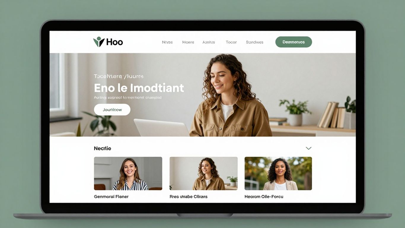
2. Gretel
Gretel takes a slightly different approach right off the bat. Instead of jumping straight into visuals, they greet you with a short, clear explanation of what they do. This is a smart move because it immediately tells visitors what to expect. After that initial intro, the site really comes alive. They showcase their projects with some neat animations, which definitely makes things more interesting than just static images. It’s a good reminder that sometimes, starting with a simple text explanation of your business can be really effective.
Here's what makes Gretel's layout work:
- Clear Introduction: A brief text section at the beginning explains their specialty.
- Animated Project Showcase: Uses motion to display their work, keeping visitors engaged.
- Squarespace Platform: Built on a user-friendly platform, suggesting ease of management.
The key takeaway here is that you don't always need a flashy hero image to grab attention. Sometimes, a well-written sentence or two can do the job just as well, if not better, before you wow them with your portfolio.
3. Seattle Dental Co
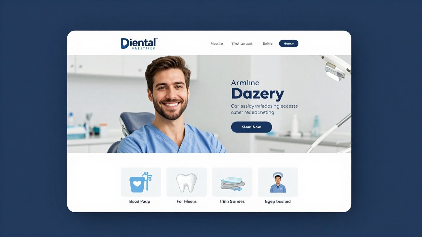
Seattle Dental Co. uses a split-screen approach for its hero section, which is a smart way to present information. On one side, you get clear text explaining their services, and on the other, a slider showcases visuals – maybe patient transformations or the clinic itself. This keeps things dynamic without overwhelming the visitor.
Their header is also pretty neat; it floats as you scroll, meaning the company name, a clickable phone number, and a menu icon are always within reach. This is super handy if you want people to call you directly. It’s a small detail, but it makes a big difference for immediate contact.
Making your contact information easily accessible, especially a phone number, can significantly improve appointment bookings for service providers. It removes a barrier for potential clients who prefer direct communication.
They also include a client testimonials slider, which is a great way to build trust. Seeing positive feedback from others can really sway a potential patient. Plus, having Google Maps in the footer shows exactly where they are located, which is helpful for local businesses. This kind of layout is great for service providers who want to be found easily and want to make booking an appointment as simple as possible. It’s a solid example of how to blend information and calls to action effectively, especially when considering how search engines are changing and focusing more on user intent and direct answers, which is key for local SEO in 2026.
Here’s a quick look at some of their layout features:
- Split-Screen Hero: Combines text and visuals effectively.
- Floating Header: Keeps key contact info and navigation accessible.
- Testimonial Slider: Builds credibility through social proof.
- Footer Map: Clearly shows the physical location.
4. Harper Construction
Harper Construction shows how a construction business can have a solid online presence without needing a super complicated website. They use Squarespace, which is pretty common for service providers these days.
What really makes their site work is the background image that stays put as you scroll, combined with a header that's see-through. It makes you feel welcome right away. They also break down their company's story and what they do into easy-to-digest chunks, and show off some of their past projects.
Here’s a quick look at what they do well:
- Clear Service Sections: They make it simple to see what kind of work they offer.
- Project Showcase: Their portfolio gives potential clients a good idea of their quality.
- Transparent Header: This design choice makes the site feel more open and connected.
A transparent header can really tie a website together, giving it a smooth, modern look that invites visitors to explore further without feeling blocked by the navigation.
Their approach proves that a clean, straightforward design can be very effective for building trust and showing off their capabilities. It’s a good reminder that sometimes, less is more when it comes to web design for service-based businesses.
5. Chris Boyer
Chris Boyer’s website is a good example of how to handle a lot of information without making it feel overwhelming. Even with a big block of text sitting between two large parallax images, the site remains easy to look through. This approach shows that you don't need to shy away from detailed content if you present it well.
The key here is balancing text with visuals. When you have a lot to say about your services or your background, using large, engaging images on either side of that text can make a huge difference in how a visitor experiences your site. It breaks up the content and gives the eyes a place to rest.
Here’s a breakdown of how Chris Boyer’s site works:
- Navigation: Services, important information, and a contact page are all easily accessible from the main navigation bar. This makes it simple for potential clients to find what they’re looking for quickly.
- Visuals: Large parallax images are used strategically to frame text sections. This adds depth and visual interest, making the overall experience more pleasant.
- Content Presentation: The site proves that detailed service descriptions or company history can be presented effectively when paired with strong visual elements.
When you have a lot of information to share, think about how you can use images to support and break up the text. This makes your website more inviting and less like reading a textbook. It’s all about making the visitor’s journey smooth and enjoyable.
6. Kelsey O’Halloran
Kelsey O’Halloran’s website really hits you with a personal vibe right off the bat. It’s a smart mix of friendly images and text that grabs your attention, but don’t let that fool you – she’s serious about her services. You can see clear presentations of what she does, stories from past clients, and those all-important call-to-action buttons.
What’s pretty cool is how much detail she packs into the footer. Usually, footers are just an afterthought, but hers is loaded with useful info, and somehow, it just works. It shows you don’t always need a super formal, stiff website to be taken seriously.
Here’s a breakdown of what makes her site effective:
- Personalized Imagery: Uses photos that give a sense of her personality and approach.
- Clear Service Sections: Details what she offers without being overwhelming.
- Client Testimonials: Social proof that builds trust.
- Strategic CTAs: Guides visitors on what to do next.
The key takeaway here is that a website doesn't have to be overly corporate to be professional. Injecting some personality can actually make your business more approachable and memorable for potential clients.
7. Shanley Cox
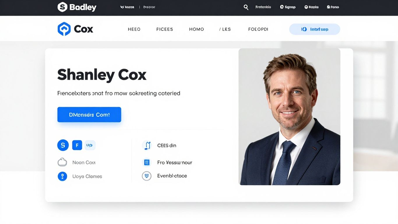
Shanley Cox’s website really makes you feel like you know her, even if you’ve never met. It’s built on Squarespace and feels almost like a single page, packing in services, testimonials, an about section, contact form, and even an Instagram feed all in one spot. The design is pretty minimalist, with some nice feminine touches that just make the whole experience pleasant.
The main takeaway here is to use your website as a way to show your personality. When potential clients get a sense of who you are, it builds a connection. It’s not just about listing what you do; it’s about showing them the person behind the service.
Here’s what makes her approach work:
- Personal Connection: The design and content work together to create a friendly, approachable vibe.
- All-in-One Page: Having key information easily accessible on the homepage makes it simple for visitors to find what they need.
- Visual Appeal: The minimalist design with feminine accents is easy on the eyes and reflects a specific aesthetic.
It’s a good reminder that a website doesn't have to be overly corporate or stiff. Letting your authentic self shine through can actually be a powerful marketing tool. People connect with people, after all.
This approach is great for service providers who want to build a strong personal brand. It shows that you can be professional while still being relatable. For anyone looking to create a similar vibe, thinking about how to integrate your personal story and style into your custom website design is key.
8. La Playa
La Playa really nails the visual presentation for a service provider. Their homepage uses a grid layout that’s super clean, and the navigation stays put on the right side, which is pretty neat. When you hover over their portfolio items, one highlights while the others dim down a bit. It’s a subtle effect, but it really draws your eye to what’s active.
What’s cool about their approach is how they link directly to live projects. This lets potential clients see the actual work in detail, which builds a lot of trust. It’s a smart way to show off what you can do without just telling people.
Showing actual, completed projects is a powerful way to demonstrate your capabilities. It provides tangible proof of your skills and the quality of your output, allowing clients to assess your work firsthand.
Here’s a breakdown of what makes their layout work:
- Grid-style Homepage: Organizes content visually and makes it easy to scan.
- Sticky Sidebar Navigation: Keeps key links accessible without scrolling.
- Interactive Portfolio Elements: Uses hover effects to guide user attention.
- Direct Links to Live Projects: Offers concrete examples of past work.
This kind of layout is especially effective for creative services or agencies where showcasing a portfolio is key to building credibility. It’s all about making it easy for people to see your best work and understand what you’re all about.
9. Jessica Manning
Jessica Manning’s website is a really nice example of how to show off what you do without sounding like you’re constantly trying to sell something. It feels personal and professional all at once.
One of the first things you notice is the full-screen image in the background. It really pulls you in. Then there’s the header that sits right on top of that image, almost like it’s floating, and it’s see-through. This makes the whole top part of the site feel really open and modern. After that, a full-screen slider takes over, showing off more visuals or key information. The testimonial section is particularly strong, making past clients’ words really stand out.
Here’s a breakdown of what makes it work:
- Full-Screen Image Background: Grabs attention immediately and sets a mood.
- Transparent Header: Creates a clean, uninterrupted look.
- Full-Screen Slider: Allows for showcasing multiple pieces of content effectively.
- Bold Testimonial Section: Builds trust by highlighting positive feedback.
The key here is balance. You want to inform visitors about your services and show them why you’re a good choice, but it shouldn’t feel like a constant sales pitch. Jessica Manning nails this by letting the visuals and client feedback do a lot of the talking.
10. Mindy Nguyen
Mindy Nguyen's website really shakes things up with its hero section. Instead of just plain text, she uses cool GIFs that pop up and grab your attention right away. This makes reading about her services way more interesting and sparks curiosity. It’s a smart way to make visitors want to stick around and see what she’s all about.
Beyond the initial hook, the homepage also lays out descriptions and links to her different projects. This gives people a clear path to explore her work without feeling lost. It’s a good example of how a bit of animation can make a big difference in keeping people engaged.
Using animations or even fun emojis, instead of just words, can make your site feel more alive and approachable. It’s about creating an experience that’s not only informative but also enjoyable to interact with.
Here’s a quick look at what makes her site stand out:
- Animated Hero Section: Uses GIFs to create immediate interest and curiosity.
- Project Showcase: Clear descriptions and links to past work.
- Engaging Content: Makes the user experience more dynamic and less static.
- Built with Squarespace: Shows a common platform can be used for creative designs.
Looking to boost your website's visibility and attract more customers? Mindy Nguyen is here to help you climb the search engine ranks. We specialize in making your online presence shine. Visit our website today to learn how we can transform your digital strategy and get you noticed!
Wrapping It Up
So, we've looked at a bunch of cool ways to set up your service website. It's not just about having a page online; it's about making it work for you and your clients. Whether you're going for that super clean, minimalist look or something a bit more creative with animations and big images, the main thing is to make it easy for people to see what you do and how to get in touch. Don't be afraid to show off your best work and let your personality shine through. A good website layout can really make a difference in attracting and keeping customers, so take these ideas and make them your own.
Frequently Asked Questions
What makes a good website for a service provider?
A great service website clearly shows what you do, makes people remember you, and helps potential customers quickly see if you're the right fit. It uses colors, shapes, and design to tell your business's story.
Should I use lots of text or images on my service website?
It's best to balance text and images. For businesses with visual work, like designers or builders, letting beautiful photos take center stage can be very effective. For others, using images to break up text makes it easier to read.
How important is the 'hero section' of a website?
The hero section is the first thing visitors see. It's super important for making a good first impression. It should quickly tell people what your business is about and grab their attention.
Can I make my service website unique?
Absolutely! Don't be afraid to add your own creative touch. Unique features, like a special animation or a different way of showing your work, can make your site stand out from others.
Should I make it easy for people to book my services?
Yes, definitely! Having clear 'Book Now' buttons or contact links visible throughout your website makes it simple for interested customers to take the next step.
What if I have a lot of information to share?
If you have a lot to say, consider a one-page website design where content is organized to encourage scrolling, or make sure your navigation is clear so people can easily find different sections like services, about, and contact.


Comments
Post a Comment