The Art of the Homepage: Designing for Search, Clicks, and Conversions in 2025
So, you've got a website, but is it actually *doing* anything for you? It’s easy to get caught up in how a site looks, but what really matters is how it performs. We’re talking about making your homepage work harder – getting people to click, stay around, and ultimately, do what you want them to do. In 2025, it’s all about being smart with design, making sure people trust you right away, and guiding them smoothly towards becoming customers. Let’s get into The Art of the Homepage: Designing for Search, Clicks, and Conversions.
Key Takeaways
- Your homepage needs to answer three quick questions: What do you do? Who is it for? And why should they care? Get this wrong, and people leave.
- Make your main message and a clear action button (like 'Sign Up' or 'Buy Now') visible right away, without making people scroll. Add proof, like customer logos, to build trust fast.
- Landing pages are built for one specific job – getting someone to take one action. Cut out anything that might distract them from that goal.
- Websites in 2025 are leaning towards looking real, being eco-friendly, and having a strong visual style. Think bold colors and unique layouts, but keep it functional.
- Make your website work for each visitor by showing them content they'll like. This means adapting what they see based on what they've looked at before or their past actions.
Crafting The Homepage: Your Digital Front Door
Think of your homepage as the main entrance to your digital space. It’s the first impression, and honestly, it has mere seconds to make a good one. Visitors arriving here need to figure out pretty quickly what you’re about, who you’re for, and why they should stick around. If this initial greeting is confusing or bland, they’re likely to just turn around and leave. It’s that simple.
Answering Critical User Questions Instantly
When someone lands on your page, they’re usually looking for something specific. Your homepage needs to answer these core questions right away:
- What problem do you solve?
- Who is your ideal customer?
- What makes you different or better than the rest?
Getting these answers out clearly and upfront is key. It’s not about fancy words; it’s about direct communication. For example, instead of saying "We offer innovative digital solutions," try "We help local restaurants get more online orders." See the difference? One is vague, the other is specific and tells you exactly who it's for and what it does.
The Power of a Clear Value Proposition
Your value proposition is the heart of your homepage. It’s the promise you make to your visitors. This statement should be front and center, usually in the hero section, and it needs to be crystal clear. It tells people the main benefit they’ll get from engaging with you. A strong value proposition isn't just a slogan; it's a concise explanation of why a customer should choose you. It’s what sets you apart and gives visitors a reason to explore further. Think about what makes you unique and communicate that benefit directly.
Strategic Placement of Calls-to-Action
Once you’ve grabbed attention and explained what you do, you need to tell people what to do next. This is where calls-to-action (CTAs) come in. These are the buttons or links that guide users toward a specific goal, like signing up for a newsletter, requesting a quote, or making a purchase. CTAs should be easy to find and understand. Placing them strategically, often above the fold (the part of the page visible without scrolling), ensures that visitors know the next step without having to hunt for it. Using action-oriented language on these buttons, like "Get Started" or "Download Now," is much more effective than generic terms. Remember, a well-placed CTA can be the difference between a visitor who leaves and one who becomes a lead or customer. Integrating SEO into website design from the outset is crucial for optimal performance, and clear CTAs are a big part of that discoverability.
The homepage's primary job isn't to close the deal, but to open the door. It needs to pique interest and direct traffic to the pages where conversions actually happen. Think of it as a well-organized lobby that points guests to the right rooms.
Designing For Immediate Impact And Trust
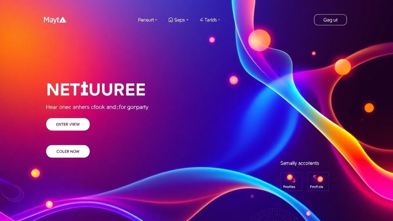
Your homepage is like the front door to your business online. It’s got maybe 50 milliseconds to make a good impression, and honestly, that’s not a lot of time. If it looks messy or confusing, people just turn around and leave. So, how do you make sure that first look counts and that visitors actually feel like they can trust you?
Leveraging Full-Height Hero Sections
The hero section is that big, eye-catching area right at the top of your page. Making it full-height means it takes up the whole screen when someone first lands, forcing them to pay attention. This is prime real estate for your main message. You need to clearly state what you do, who you help, and why they should care, right there. Think of it as your elevator pitch, but visual. A strong headline and a clear picture or video can grab someone's attention instantly. This initial visual statement sets the tone for everything that follows.
Building Credibility with Social Proof
People are more likely to trust you if they see that others already do. This is where social proof comes in. It’s like getting a recommendation from a friend, but online. Think about including things like:
- Customer reviews and testimonials, especially with real photos and specific details about what they liked.
- Logos of well-known clients you’ve worked with.
- Key statistics that show your success, like "Over 10,000 satisfied customers" or "98% success rate."
- Trust badges or security seals, especially if you handle payments or sensitive information.
These elements show visitors that you're legitimate and that other people have had good experiences with you. It’s hard to argue with a happy customer.
The Role of Visual Hierarchy and Negative Space
Visual hierarchy is basically how you arrange things on the page so people naturally know what to look at first, second, and so on. Bigger headlines, bold text, and contrasting colors naturally draw the eye. It’s like a roadmap for their eyes. Then there’s negative space, which is just the empty areas around your content. It might seem like wasted space, but it’s actually super important. It stops the page from looking cluttered and helps people focus on the important bits, like your call-to-action buttons. When a button has space around it, it really stands out and feels like the obvious next step. It’s all about making things easy to understand at a glance.
Optimizing For Clicks And Deeper Engagement
So, your homepage has done its job and grabbed attention. Now what? The real work begins: turning that initial interest into something more. It’s not just about getting a click; it’s about guiding people deeper into your site, making them feel like they’ve found exactly what they need, and nudging them towards that final conversion goal. Think of your homepage as the start of a conversation, and these next steps are about keeping that conversation going.
Transforming Homepages for Lead Generation
Your homepage doesn't need to be a jack-of-all-trades. Instead, focus on making it a powerful engine for lead generation. This means strategically placing elements that encourage visitors to share their contact information. Think about offering a valuable download, like a guide or checklist, in exchange for an email address. This is where smart pop-ups and sticky bars come into play. They can be incredibly effective if timed right and offer something genuinely useful, not just a generic discount. For example, an exit-intent popup that offers a special resource just as someone is about to leave can capture a lead you might otherwise lose.
- Exit-intent popups: Appear when a user's cursor moves towards closing the tab.
- Scroll-triggered offers: Display after a visitor has scrolled a certain percentage down a page, showing they're engaged.
- Timed popups: Appear after a set duration, giving users a chance to explore first.
The goal here is to present the right offer, at the right moment, to the right person. It's about being helpful, not intrusive.
Guiding Visitors to Explore Further
Once you've captured a lead or made a strong first impression, the next step is to make it easy for visitors to find what they're looking for and discover more. This involves creating clear pathways through your site. Use compelling internal links within your content that point to relevant product pages, blog posts, or service descriptions. Visual cues, like well-designed buttons and clear navigation menus, are also key. Don't overwhelm visitors with too many choices at once. Instead, think about what they might want to see next based on their initial interaction and guide them there.
Consider these elements:
- Clear internal linking: Connect related content logically.
- Prominent "Learn More" buttons: Direct users to detailed information.
- Categorized "Featured" sections: Showcase popular or relevant products/services.
The Art of Persuasive Content Creation
Every piece of text on your homepage, and indeed throughout your site, should work towards encouraging action. This means moving beyond just describing what you do to explaining the benefits for the user. Use language that speaks directly to their needs and pain points. Instead of saying "We offer SEO services," try "Get found by more customers with our proven SEO strategies." Strong calls-to-action (CTAs) are vital. They need to be clear, concise, and tell the user exactly what to do next. Buttons like "Download Your Free Guide" or "Request a Consultation" are much more effective than generic "Submit" buttons. Remember, the content isn't just informative; it's persuasive. It needs to build trust and convince visitors that you have the solution they're looking for.
The Anatomy Of High-Converting Landing Pages
Single-Minded Focus on Conversion Goals
Landing pages are built for one thing: getting someone to do a specific action. Think signing up for a newsletter, downloading a guide, or requesting a demo. Unlike your main website, which has lots of paths, a landing page strips away distractions. It’s like a direct route to a single destination. Every element on the page should push the visitor towards that one goal. If it doesn't help with the conversion, it probably shouldn't be there.
Eliminating Distractions for Clear Paths
To make sure visitors stay focused, you need to remove anything that could pull them away. This means cutting down on navigation menus, links to other parts of your site, or anything that might make them think, "Oh, I should check this out instead." The goal is to create a clear, unobstructed path from the moment they land on the page to the moment they complete the desired action. This focused approach is key to improving user experience.
- Minimize or remove site-wide navigation.
- Avoid external links that lead away from the page.
- Keep the design clean and uncluttered.
- Use clear, concise copy that stays on topic.
The best landing pages are like a well-told story with a clear beginning, middle, and end, where the end is the conversion you want.
Message Matching for Consistent User Journeys
When someone clicks on an ad or a link, they expect to land on a page that delivers exactly what was promised. This is called message matching. If your ad talks about a "free ebook on gardening," the landing page needs to be about that free ebook, not a general page about your nursery. This consistency builds trust right away. If the message doesn't match, visitors get confused or feel misled, and they'll likely leave. It’s about making sure the journey from the click to the conversion feels natural and expected.
Here’s a quick look at what makes a good match:
| Ad Headline/Promise | Landing Page Headline | Key Content Focus |
|---|---|---|
| "Get 20% Off Your First Order" | "Your 20% Discount Awaits!" | Details of the discount, how to apply it |
| "Download Our Latest Marketing Report" | "Free Marketing Report Available Now" | Report summary, download form |
| "Request a Free Consultation" | "Schedule Your Free Consultation Today" | Benefits of consultation, booking form |
Integrating Modern Design Trends for 2025
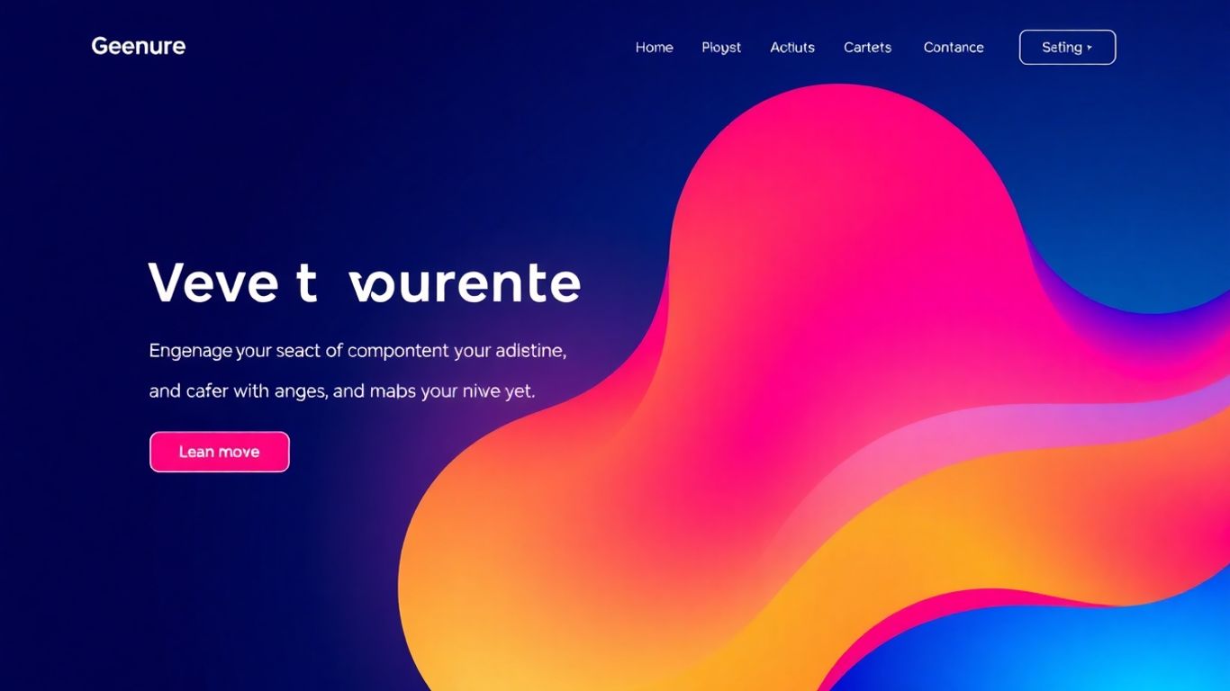
So, what's hot in web design for 2025? It's a mix of things, really. We're seeing a move towards designs that feel more real, maybe a bit less polished than what we've gotten used to. Think bold colors, interesting layouts, and fonts that really grab your attention. It’s about making a statement, but also making sure people can actually use the site without getting lost.
Authenticity, Sustainability, and Bold Aesthetics
Websites in 2025 are leaning into a more human feel. This means embracing imperfection, maybe even a bit of what some call 'anti-design'. It’s not about being messy for the sake of it, but about breaking away from overly slick templates. Brands are using strong typography and sometimes clashing colors to stand out. It’s a way to show personality and be memorable. Plus, there's a growing focus on making websites that are also good for the planet, using less energy and being more efficient.
- Bold Typography: Big, expressive fonts that tell a story. Variable fonts are great for this, offering flexibility and speed.
- Vibrant Color Palettes: Think high contrast and blocky sections that guide the eye. It’s about making things pop.
- Authentic Feel: Moving away from perfect, sterile designs towards something more genuine and relatable.
- Sustainability: Designing with efficiency in mind, reducing digital waste.
The trend towards authenticity means designers are playing with asymmetry and unexpected layouts. It’s a way to challenge the norm and create a unique brand identity that feels more honest.
Evolving Grid Systems for Fluid Layouts
Grids aren't going anywhere, but they're getting more flexible. Instead of rigid boxes, think of them as guides that allow for more creative freedom. This means designs can adapt better to different screens and still look good. Even with those bold color blocks or more raw, brutalist styles, a smart grid system keeps things organized and working right.
| Design Element | 2024 Approach | 2025 Evolution |
|---|---|---|
| Grid Systems | Strict, often predictable layouts | Fluid, adaptable, supporting creative freedom |
| Layouts | Symmetrical, balanced | Asymmetrical, experimental, block-based |
| Typography | Clean, readable | Bold, expressive, variable, high-contrast pairs |
Dynamic Full-Page Headers with Restraint
Full-page headers are still a thing, but they're not just static images anymore. They're becoming more interactive, using subtle animations to tell a story or introduce the brand. The trick for 2025 is to do this without overdoing it. It’s about making a big impact but keeping things efficient and not overwhelming the user. Think of it as a grand entrance that’s well-timed and purposeful, not just loud.
Enhancing User Experience Through Personalization
Tailoring Content to User Preferences
Think about the last time you visited a website and it felt like it just knew what you were looking for. That's personalization at work. It’s not just about showing ads; it’s about making the entire experience feel more relevant to each person. For example, if someone keeps looking at hiking boots, showing them more hiking gear, maybe even suggesting related items like waterproof socks, makes a lot more sense than showing them dress shoes. This kind of tailored approach makes visitors feel understood and saves them time.
Seamlessly Adapting the Entire Website Experience
This goes beyond just the homepage. Imagine a site that remembers your preferred language, your past purchases, or even the types of articles you tend to read. It's like the website itself is having a conversation with you, adjusting its tone and content as it goes. For online stores, this could mean showing you items you've browsed before or reminding you about things left in your cart. It’s about creating a flow that feels natural, not forced.
Prioritizing Recently Viewed and Saved Items
We all have those moments where we see something interesting but aren't ready to buy or commit. Websites that make it easy to find those items again are gold. This means having clear sections for 'Recently Viewed' or 'Saved for Later.' It’s a simple feature, but it really helps people pick up where they left off. It shows you're paying attention to their journey and want to make it easy for them to come back.
The goal here is to make the digital space feel less like a crowded marketplace and more like a helpful assistant. When a website adapts to what a user likes and needs, it builds a connection. This connection is what keeps people coming back and eventually leads to them taking the desired action, whether that's making a purchase or signing up for a newsletter.
Accessibility and Inclusivity as Core Design Principles
Beyond Compliance: Thoughtful Web Design
Thinking about accessibility and inclusivity in web design isn't just about ticking boxes to meet legal requirements anymore. It's about making sure everyone, no matter their abilities, can actually use your website. Seriously, it’s moved from a 'nice-to-have' to a 'gotta-have'. When you design with everyone in mind from the start, you build a better experience for all your visitors. It’s like making sure your front door has a ramp – it helps people with wheelchairs, but it also makes it easier for people with strollers or even just someone carrying a lot of groceries.
Designing for accessibility means considering a wide range of users and their potential needs. This includes people with visual impairments, hearing loss, motor difficulties, and cognitive differences. It’s about creating a digital space that’s welcoming and functional for as many people as possible.
Elements That Improve Navigation and Interaction
There are a few key things you can do to make your site more usable for everyone. These aren't super complicated, but they make a big difference.
- Color Contrast: Make sure there's enough difference between your text color and the background color. This helps people with low vision read your content without straining.
- Focus Indicators: When someone uses a keyboard to move around your site (instead of a mouse), there's usually a little outline that shows where they are. Make sure this outline is clear and easy to see.
- Form Labels: Instead of just having a placeholder in a form field that disappears when you start typing, use clear labels that stay visible. This helps people understand what information is needed.
- Image Alt Text: For images, add descriptive alternative text. Screen readers use this text to describe the image to visually impaired users, and it also helps with search engine optimization.
Increasing Conversions Through Wider Audiences
So, why bother with all this? Well, besides it being the right thing to do, it actually helps your business. When more people can use your site, more people can buy your stuff or sign up for your service. It’s pretty straightforward.
| Metric | Potential Improvement | Notes |
|---|---|---|
| Website Traffic | Up to 20% | Reaching users who previously couldn't access |
| Conversion Rate | Up to 10% | Easier user journeys lead to more sales |
| SEO Ranking | Moderate Boost | Alt text and semantic HTML help search engines |
| Brand Reputation | Significant Positive | Shows commitment to inclusivity |
Basically, by making your website accessible, you're not just being nice; you're opening up your business to a larger customer base and potentially seeing a nice bump in your results. It’s a win-win, really.
Making sure everyone can use your website is super important. We believe that designing with everyone in mind, no matter their abilities, should be a top priority from the start. It's not just a good idea; it's essential for reaching all your potential users. Let us help you build a site that's welcoming and easy for everyone to navigate. Visit our website today to learn how we can make your online presence accessible to all!
Wrapping It Up: Your Homepage as a Conversion Machine
So, we've talked a lot about making your homepage work harder. It's not just about looking good anymore; it's about getting people to actually do something, whether that's buying a product or signing up for a newsletter. Think of your homepage as the main entrance to your business online. If it's confusing or doesn't clearly say what you offer, people will just walk away. We covered how to make your message super clear right at the top, using strong calls to action, and building trust with things like customer reviews. Remember, a website that's designed to convert isn't just a nice-to-have; it's pretty much a must-have if you want your business to grow online. Keep testing, keep tweaking, and focus on making things easy for your visitors. That's how you turn clicks into customers.
Frequently Asked Questions
What's the most important thing to do when someone first visits my website?
You have only a few seconds to tell visitors what you do, who you help, and why they should care. Make sure your website's main message is super clear right at the top. Think of it like a quick hello that explains everything important right away.
How can I make people trust my website quickly?
Show off happy customers! Things like testimonials, reviews, or even a number like 'Over 500 happy clients' can make new visitors feel more confident about your business. Also, make sure your website looks professional and works well on phones.
What's the goal of my homepage?
Your homepage isn't meant to do everything. Its main job is to get people interested enough to look at other pages on your site. It should guide them to learn more about what you offer or take a specific next step.
What makes a landing page good at getting people to take action?
Landing pages are like specialists. They have one main goal, like getting someone to sign up or buy something. The best ones remove anything that might distract people, like too many links, so visitors can focus on the one action you want them to take.
How can I make my website more appealing to visitors in 2025?
Websites in 2025 are focusing on being real and unique. Think about using bold colors and interesting designs, but also make sure your site is easy to use and doesn't take too long to load. Being honest and showing you care about things like the environment can also help.
Why is it important for my website to work for everyone?
Making your website easy for everyone to use, including people with disabilities, isn't just the right thing to do. It helps you reach more people, improves your search engine ranking, and can actually lead to more people taking action on your site.


Comments
Post a Comment