Designing Landing Pages That Google Loves and Users Trust: A Comprehensive Guide
Building landing pages that people actually want to click on and that Google notices can feel like a puzzle. It’s not just about looking pretty; it’s about making things clear, earning trust, and guiding folks towards that one important action. We’re going to break down how to make pages that do just that, focusing on Designing Landing Pages That Google Loves and Users Trust.
Key Takeaways
- Make your main message super clear right at the top. People should know what you’re offering and why they should care instantly.
- Build trust by showing that other people like what you do. Use real comments or well-known company logos.
- Keep the page simple and easy to follow. Guide visitors’ eyes to the main action you want them to take.
- Make your call to action stand out and tell people exactly what to do next. Use strong words and make it obvious.
- Pages that load fast and look good on phones and computers are more likely to work well.
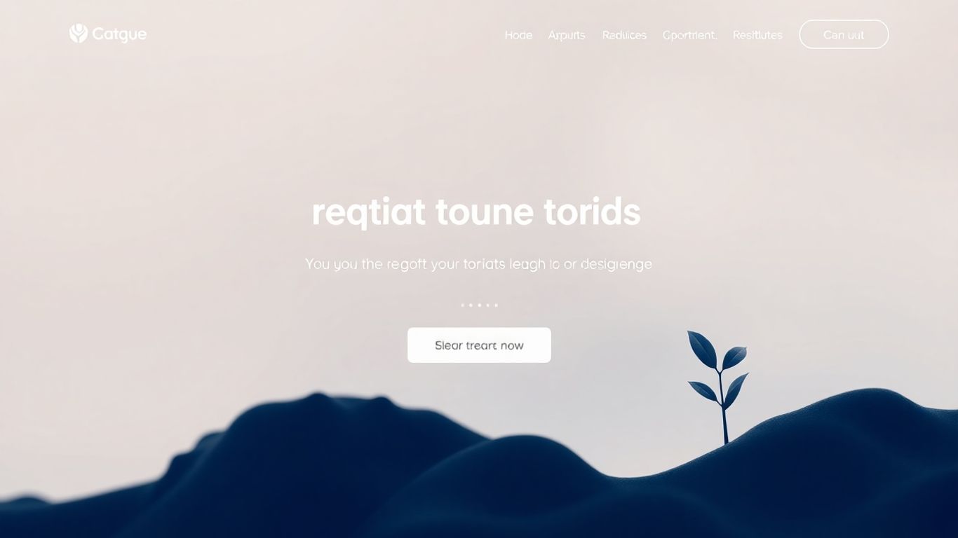
Crafting Compelling Landing Page Headlines
The headline is the very first thing someone sees when they hit your landing page. It's like the cover of a book – it needs to make people want to read more, or in this case, stick around and take action. If your headline is weak, people will just bounce. It’s that simple.
Communicating Value Clearly
Your headline needs to tell visitors exactly what they're going to get. No beating around the bush. Think about what problem you're solving for them or what benefit they'll receive. For instance, instead of saying "Our New Software," try something like "Automate Your Social Media Posting in Minutes." This immediately tells the user the benefit and the speed.
- State the primary benefit upfront.
- Use clear, direct language.
- Avoid jargon that your audience might not understand.
Addressing Audience Needs
Who are you talking to? Your headline should speak directly to their pain points or desires. If you're selling a time-saving app, your headline could be "Reclaim Your Evenings with Effortless Task Management." This shows you understand their struggle and offer a solution. It's about making the visitor feel seen and understood. A good headline connects with the user's current situation, making your offer feel relevant and necessary. This initial connection is vital for building trust.
Using Benefit-Driven Language
Focus on what the user gains, not just what you do. Instead of "We Offer SEO Services," consider "Rank Higher on Google and Get More Customers." The second option highlights the outcome the user wants. People are more motivated by what they will achieve than by the features of a product or service.
The best headlines don't just describe; they promise a positive outcome. They paint a picture of a better future for the visitor, making them eager to learn how to get there.
Here’s a quick comparison:
| Feature-Focused Headline | Benefit-Focused Headline |
|---|---|
| "Learn About Our Course" | "Master a New Skill in 30 Days" |
| "Sign Up for Our Newsletter" | "Get Weekly Tips to Boost Your Business" |
| "Download Our Ebook" | "Solve Your Biggest Marketing Challenge Today" |
Designing For User Trust and Credibility
When someone lands on your page, especially if they've never heard of you before, they're going to be a little unsure. It's like walking into a store you've never visited – you want to know if it's a place you can rely on. Building that trust isn't just about having a nice-looking page; it's about showing visitors you're legitimate and that their interaction with you will be a good one.
Leveraging Social Proof Effectively
People tend to trust what other people are doing. If a lot of others have had a good experience, it makes us feel more comfortable trying something new. This is where social proof comes in handy.
- Showcase recognizable client logos: If big names use your product or service, put their logos up. It’s a quick way to say, "Hey, these guys trust us, so maybe you should too."
- Include customer testimonials: Real quotes from happy customers are gold. Make sure they're specific about the benefits they received. Generic praise doesn't carry as much weight.
- Display review site ratings: If you have good ratings on sites like G2 or Capterra, show them off. It’s an independent nod to your quality.
- Share relevant statistics: Numbers can be powerful. "Trusted by 10,000+ teams" or "Helped users save X hours" can really make an impact.
Remember, the key is relevance. A testimonial about how great your customer support is might not be as effective on a page selling a software download as a quote about the download's usefulness.
Don't just throw every piece of positive feedback onto your page. Pick the strongest, most relevant points that directly support the offer you're making. Think of it like adding just the right amount of spice to a dish – enough to make it interesting, but not so much that it overpowers everything else.
Ensuring Ad-to-Page Relevance
This one's pretty straightforward, but it's super important. When someone clicks on an ad, they expect to land on a page that directly relates to what the ad promised. If they click an ad for "Blue Widgets" and land on a page selling "Red Gadgets," they're going to bounce faster than you can say "misleading advertising."
- Match headlines: The headline on your landing page should echo the ad's message. If the ad said "Get Your Free Ebook," the page should say something very similar.
- Align offers: The product, service, or offer presented on the landing page must be exactly what was advertised. No bait-and-switch allowed.
- Consistent visuals: If your ad features a specific image, try to use a similar or related image on the landing page. This creates a visual connection.
Implementing Trust Badges and Testimonials
Beyond social proof, there are other signals you can use to make people feel secure. These are often smaller details, but they add up.
- Security badges: If you're collecting any kind of personal information or processing payments, showing security seals (like SSL certificates) is a must. It tells visitors their data is safe.
- Guarantees and return policies: Clearly stating a money-back guarantee or an easy return process can remove a lot of risk for the potential customer.
- Privacy policy links: Having a clear link to your privacy policy shows you're transparent about how you handle user data.
- Contact information: Making it easy for people to find your contact details (phone number, address, email) can make your business seem more real and accessible.
Think about those little reassurances you see next to a "Buy Now" button, like "Cancel anytime" or "No credit card required." These small bits of text, often called "click triggers," can make a big difference in easing hesitation right at the moment of decision.
Optimizing Landing Page Structure and Layout
Think of your landing page like a well-organized store. You want people to find what they're looking for easily, without getting lost or overwhelmed. The way you arrange things, the flow from one section to the next, it all matters a lot for getting people to take the action you want them to.
Guiding the Eye Towards Conversion
It's not just about putting stuff on a page; it's about directing attention. The goal is to make it super clear what you're offering and what you want the visitor to do next. This means thinking about how someone's eyes will naturally move across the page.
- Start with a strong headline that immediately tells people the main benefit.
- Use visuals that back up your message.
- Keep the copy focused on the offer and its advantages.
- Place your call to action (CTA) where it's easily seen, ideally right away.
This structure helps people understand the value quickly. If the page is cluttered or confusing, people will just leave. A clean layout helps them focus on the important bits.
Strategic Placement of Key Elements
Where you put things is just as important as what you put there. The area
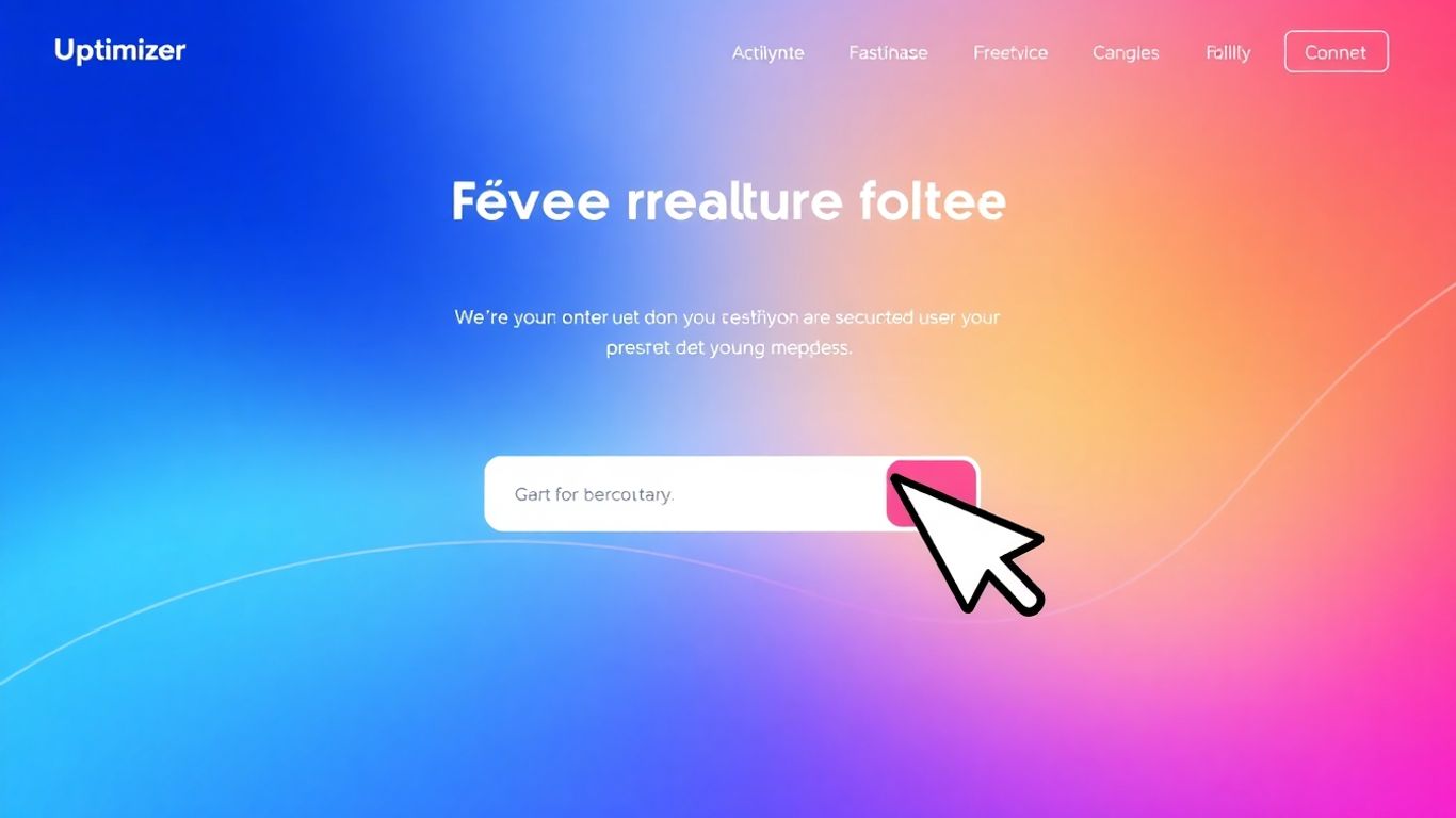
Developing Actionable Calls to Action
Employing Strong Action Verbs
This is where you tell people exactly what you want them to do. Don't be shy about it. Use words that make them want to click. Think "Get," "Download," "Start," "Join," "Claim." These are direct and tell the user the outcome of their click. It's like giving them a clear instruction manual for their next move.
Creating a Sense of Urgency
Sometimes, people need a little nudge. If your offer is time-limited, say so! Phrases like "Offer ends Friday" or "Limited spots available" can make a big difference. It makes the user feel like they need to act now before they miss out. Just make sure it's genuine; nobody likes being tricked.
Ensuring CTA Visibility and Contrast
Your call to action button needs to pop. It should be easy to spot, even if someone is just quickly scanning the page. Use bright colors that stand out from the rest of your design. Give it some breathing room with white space around it. The easier it is to see, the more likely someone is to click it.
Here's a quick rundown on making your CTA stand out:
- Color: Pick a color that contrasts with your page background.
- Size: Make it big enough to be noticeable but not so big it looks out of place.
- Placement: Put it where people will naturally look, usually above the fold or repeated lower down.
- Wording: Keep the text short, clear, and action-oriented.
Making the call to action obvious is key. If a visitor has to hunt for it, they might just leave. Think about it like a signpost on a busy street – it needs to be clear and direct.
Enhancing Landing Page Performance
So, you've got a landing page that looks good and has all the right words, but is it actually doing its job? Sometimes, the biggest wins don't come from a complete overhaul, but from smart tweaks that make things run smoother and faster. Think of it like tuning up a car; you want it to look good, but it also needs to perform well.
Prioritizing Fast Load Speeds
Nobody likes waiting around for a page to load. If your landing page takes too long, people will just leave. It's that simple. We're talking about seconds here, and even a few extra milliseconds can make a difference. Slow pages often mean lost visitors and missed chances.
- Compress images: Big image files are a common culprit for slow loading. Use tools to shrink them without losing too much quality.
- Minimize code: Clean up your HTML, CSS, and JavaScript. Remove any unnecessary bits.
- Use browser caching: This helps repeat visitors load your page faster by storing parts of it on their computer.
A page that loads quickly gives visitors a better first impression. It shows you respect their time and have put thought into their experience.
Testing Across Real Devices
What looks great on your big monitor might be a mess on someone's phone. It's super important to check how your landing page appears and works on different screen sizes and devices. People browse on all sorts of gadgets these days, and your page needs to work for everyone. We've seen pages that look fine on a desktop but are practically unusable on a mobile device, which is a huge problem. Making sure your page is responsive is key to reaching more people.
Here’s a quick checklist for testing:
- Mobile Phones: Test on various popular models (iOS and Android).
- Tablets: Check how it looks on both portrait and landscape modes.
- Desktops: Don't forget different screen resolutions.
Streamlining Code for Efficiency
Behind the scenes, the code that builds your page matters. Bloated or messy code can slow things down and even cause problems. Keeping your code clean and efficient is like having a well-organized toolbox – everything is easy to find and use.
- Remove unused code: Get rid of scripts or styles that aren't actually being used on the page.
- Optimize scripts: Make sure your scripts are running in the most efficient way possible.
- Consider lazy loading: For images or videos that aren't immediately visible, load them only when the user scrolls down to them. This speeds up the initial page load.
Integrating Visuals and Content
Think of visuals and text on your landing page as a team. They need to work together, not against each other. The goal is to make your message clearer and more engaging, not just to fill space. It’s about making the whole package more appealing and easier to understand.
Reinforcing Messaging with Graphics
Images and graphics aren't just there to look pretty. They should actively support what you're saying. If you're talking about a complex service, a simple diagram or infographic can break it down way better than a wall of text. For tangible products, high-quality photos showing the item in use can really help people picture themselves with it. It’s about making the abstract concrete and the benefits obvious.
- Illustrations or Icons: Great for explaining abstract concepts or features of a service. They can simplify complex ideas quickly.
- Product Mockups/Photos: Show what you're selling. If it's a physical item, show it clearly. If it's software, show what it looks like in action.
- Infographics: Perfect for presenting data or steps in a visual, easy-to-digest format. They can make numbers much more relatable.
The right visuals can make your value proposition instantly understandable. Instead of just telling people what you do, show them. This builds immediate connection and trust.
Balancing Copy with Visual Appeal
It's easy to go overboard with either text or images. Too much text can scare people away, and too many images without context can be confusing. You want a good mix. Think about how the text guides the reader and how the visuals break things up and add interest. Sometimes, a well-placed image can make a block of text much less intimidating. It’s a bit of an art, finding that sweet spot where the page feels full but not cluttered. This balance is key for website design and SEO working together effectively.
Using Images and Videos Strategically
Every image or video you put on the page should have a purpose. Ask yourself: does this help the visitor understand the offer? Does it build trust? Does it guide them toward the next step? If an image is just decorative, it might be taking up valuable space and slowing down your page. Consider these points:
- Relevance: Does the visual directly relate to your offer or message?
- Audience: Will your target audience connect with this type of imagery?
- Focus: Does the visual draw attention to the most important parts of the page, like your call to action?
For example, if you're selling a software product, a short video demo showing the key features in action can be far more persuasive than a long description. Similarly, using photos of actual happy customers, rather than generic stock photos, can add a layer of authenticity that's hard to beat. Just remember to keep those image files optimized so they don't slow down your page load times – nobody likes waiting around.
Making your website look good with pictures and videos is super important. It helps people understand your message better and keeps them interested. When your images and words work together, your site becomes more engaging and memorable. Want to see how we can make your content shine? Visit our website today to learn more!
Wrapping It Up
So, we've gone through a bunch of stuff about making landing pages that people actually want to click on and that Google likes too. It’s not just about making something look pretty; it’s about making it work. Think clear messages, easy-to-find buttons, and making sure people trust you right away with things like testimonials or clear contact info. And don't forget to check how it looks on phones! When all these pieces fit together, you get a page that does its job, turning visitors into leads or customers. Keep testing, keep tweaking, and you'll find what works best for your audience. It’s a bit of an art and a bit of a science, but getting it right makes a big difference.
Frequently Asked Questions
What exactly is a landing page?
Think of a landing page as a special webpage made for one main goal. When someone clicks on an ad or a link, they 'land' on this page. It's designed to get them to do one specific thing, like sign up for something or buy a product, without any extra distractions.
Why are headlines so important on a landing page?
The headline is the very first thing people see, so it has to grab their attention right away! It needs to clearly tell them what they'll get or what problem it solves. A good headline makes people want to stick around and learn more.
How can I make people trust my landing page?
Building trust is key! You can show reviews from happy customers, mention well-known companies you've worked with, or display trust badges. Seeing that others have had good experiences makes new visitors feel more comfortable taking action.
What does 'ad-to-page relevance' mean?
It means that the ad or link someone clicked on should perfectly match what they see on the landing page. If an ad promises a 'free guide,' the landing page should clearly offer that free guide. This keeps visitors from getting confused or feeling tricked.
How fast should my landing page load?
Super fast! People don't like waiting. If a page takes too long to load, visitors might leave before they even see what you offer. Making images smaller and using clean code helps the page load quickly.
What's a Call to Action (CTA)?
A Call to Action, or CTA, is the button or link that tells people exactly what to do next, like 'Download Now' or 'Sign Up Today.' It should be easy to see and use strong words to encourage visitors to click.


Comments
Post a Comment