Design Psychology Meets SEO: Leveraging Color, Layout, and Copywriting to Boost On-Page User Engagement
Ever wonder why some websites just feel right and keep you clicking around? It’s not magic—it’s a mix of color choices, layout, and the words on the page. When you put design psychology and SEO together, you get pages that not only look good but also keep people interested. In this post, we’re talking about Design Psychology Meets SEO: How Colors, Layouts, and Copy Keep Users On-Page. We’ll break down the basics and share tips that anyone can use, whether you’re new to web design or just want your site to work better.
Key Takeaways
- Color isn’t just for looks—using the right colors can change how people feel and what they do on your site.
- Organizing content to match how users naturally scan a page makes it easier for them to find what they want.
- Short, clear headlines and action buttons get more clicks than long or confusing ones.
- Social proof (like reviews) and a little urgency (like limited offers) can make people trust your site and act faster.
- Testing your site with real users, checking heatmaps, and making small changes over time leads to better engagement.
Understanding the Principles of Design Psychology in On-Page SEO
Design psychology is what makes visitors stay, click, or bounce right off your website. When you get the mix right between design and SEO, your site won’t just look appealing—it’ll actually help with SEO team collaboration, turning quick visits into meaningful engagement. Let’s unpack the basics.
How User Emotions Influence Engagement
- Colors, layout, and words all play with mood and trust. If a page feels friendly or reliable, chances are users will spend more time there.
- Images, tone, and even button styles can stir up emotion, which often leads users to click, scroll, or buy.
- Emotional triggers matter. For instance, calming blues might make a financial services site feel stable, while a jolt of red on a clearance tag creates urgency.
Sometimes, web design just needs to "feel right" before a visitor even knows what the site offers.
The Science Behind First Impressions
- Users are quick to judge—a first impression is made in less than a second.
- Layout clarity, color consistency, and headline strength all contribute to positive snap judgments.
- Here’s a quick table showing key design elements and their average impact on first-impression ratings (source: internal testing):
| Design Element | Positive Impact (%) | Negative Impact (%) |
|---|---|---|
| Clear Navigation | 85 | 10 |
| Consistent Colors | 78 | 17 |
| Fast Load Time | 92 | 4 |
Psychological Triggers That Drive On-Page Actions
- Social proof (like testimonials or reviews) makes visitors more likely to trust what they see.
- Scarcity triggers action; phrases like “Only 3 left!” nudge people to act immediately.
- Placement and contrast on buttons (for example, a bold “Buy Now”) tap into both curiosity and urgency.
First impressions aren’t just about looks—they’re about connecting, building trust fast, and guiding visitors where you want them to go. Understanding these core principles means you can design web pages that work for both real people and search engines.
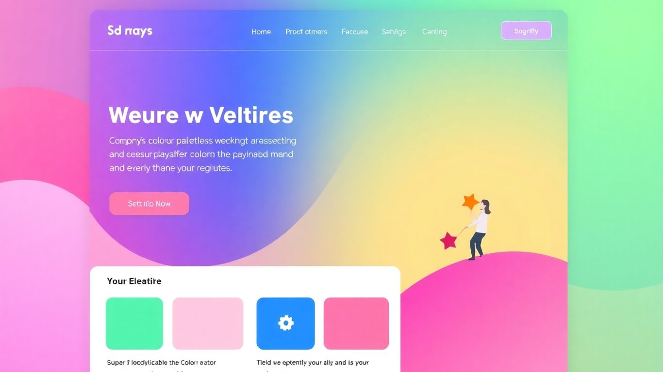
Color Psychology: Harnessing Visual Cues for User Attention
Colors aren't just decorative—they set the mood and tone the moment someone lands on your site. Different colors can push our brains to feel different things. For example, blue can make people feel calmer or more trusting, while reds can signal urgency or boost alertness. Green? It often hints at balance or a sense of growth, which is why you see it in health or eco brands.
- Blue: Trust, calm, security
- Red: Energy, excitement, urgency
- Green: Growth, freshness, health
- Orange: Action, friendliness
- Yellow: Warmth, optimism
Even a small shift in color can change how users perceive your message and affect whether they stick around to explore.
Choosing Color Palettes That Keep Users On-Page
You want your color scheme to make people comfortable, not overwhelmed or confused. A good palette sticks with a few core colors that match your brand and make navigation smooth. Foundational colors set the mood, accent colors highlight important stuff, and neutral backgrounds keep everything tidy.
Simple, well-thought-out color choices can keep someone scrolled in—complex, jarring mixes will have them closing the tab.
Tips for Picking Palettes:
- Start with your brand's main color and build around it.
- Use 2-3 main colors with easy-on-the-eyes neutrals.
- Check the contrast to make sure text stands out against backgrounds.
| Palette Part | Purpose | Example |
|---|---|---|
| Primary Color | Sets main mood & recognition | Blue |
| Accent Color | Draws attention to actions | Orange |
| Neutral Base | Supports content visibility | Light grey |
Using Contrast to Guide User Focus and Actions
Contrast is what helps users spot what’s important, fast. High-contrast buttons or links stand out, while low-contrast text can get skimmed over—or missed entirely. You need the right balance so nothing blanks out or strains the eye.
- Make call-to-action (CTA) buttons pop with a contrasting color.
- Place important info on backgrounds that highlight—not hide—it.
- Keep non-interactive stuff less bright so it doesn’t distract.
Strong contrast isn’t just about looking good. It also helps people with vision differences interact comfortably with your site.
Strategic Layouts: Organizing Content to Match User Scanning Patterns
Getting people to stick around on a page comes down to more than just flashy images and good writing. The way you structure your layout can make or break how people interact with your content. Let’s get into what really works for keeping eyes where you want them and making sure nothing important gets missed.
Implementing the F-Pattern for Maximum Visibility
When someone lands on a web page, their eyes don’t wander randomly—they usually scan in what’s called an F-pattern. That means they focus heavily on the top and left, then drop down, glancing sideways here and there. If you’re smart about it, you can use this to your advantage:
- Put your key headlines and value statements in the areas people see first (top left)
- Align your navigation and major CTAs along the left or the top row
- Chunk text into short lines with headers and bullet points, so skimming is easy
| Area of Page | User Attention (approximate) |
|---|---|
| Top Left | Very High |
| Upper Center | High |
| Left Side Middle | Moderate |
| Lower Right | Low |
If you structure your content for the F-pattern, you reduce the chance of your most important stuff getting skipped. Placing primary actions and headlines in those key zones pays off fast.
Creating Clear Visual Hierarchies
If everything on your page looks the same, you’re going to confuse your readers. Visual hierarchy guides people to the next logical step, letting them know what’s most important at a glance. Here’s how you can pull this off:
- Make your headings bold or larger than other text
- Use contrasting colors strategically, but keep it consistent and not too wild
- Place whitespace around key sections to draw the eye naturally
- Set important buttons or actions closer to the top or in spots where attention lingers
A clear hierarchy doesn’t just look good—it makes the whole page easier to use. If done right, people find what they came for without feeling lost. For instance, mapping your content plan alongside a logical menu structure, like planning your navigation for SEO, keeps everything connected and easy to follow.
Utilizing White Space for Enhanced Readability
White space—basically the blank gaps between your content—might seem boring, but it silently works wonders. It stops pages from feeling cluttered or overwhelming, which is a big deal for keeping bounce rates low. When done well, white space can:
- Make text easier to read
- Separate different content sections so users don’t get lost
- Draw attention to the important stuff, like CTAs or offers
Don’t be afraid of a little emptiness—giving your content some room to breathe helps users process information better and makes for a smoother scrolling experience.
So, in the end, if you make your layout work with natural scanning habits, show what’s important clearly (without making it visually chaotic), and give everything enough space, user engagement usually follows. Shrinking the gap between design and reader habits is a simple move with big results.
Copywriting Tactics That Encourage User Interaction
Great website copy is like a conversation. It doesn’t just talk at users—it pulls them in and actually gets them to do something. Words set the tone, nudge action, and help keep visitors from bouncing after a few seconds. Let’s break down how strategic copywriting can make users stick around and take action.
Crafting Persuasive Headlines and CTAs
Most folks don’t read every word. They skim. That’s why headlines and call-to-actions (CTAs) matter so much. They’re the signposts guiding users down your page.
- Clarity beats cleverness. Users want to know what they’re getting without guessing.
- Start with action verbs. Examples: "Start Now," "Download Free Guide," or "Join the Waitlist".
- Promise something specific (“Unlock 20% Off” beats “Check Our Sale”).
| Common CTA Words | Action-Oriented Upgrade |
|---|---|
| Submit | Get My Free Quote |
| Learn More | See How It Works |
| Buy Now | Grab Yours Before It’s Gone |
If your CTA sounds boring, your click rate will probably be, too. Choose words that make people want to click—even if just out of curiosity.
The Role of Storytelling in User Retention
Stories keep people reading when bullet points lose their spark. Good storytelling helps users see themselves in the content, which lowers their guard and ups trust.
Try these steps for using stories:
- Start with a relatable problem or moment (“Ever tried to fix a leaky faucet at midnight?”)
- Walk them through the struggle or need.
- End with a solution—ideally, your product or idea.
You don’t need a novel. A short anecdote or customer snapshot works fine. Give the reader a reason to care and help them picture their own win.
Optimizing Copy for Conversion and Engagement
To boost conversions, you need words that pull people through your page. Tips include:
- Keep paragraphs short and punchy—no one wants to read a wall of text.
- Use bullet points to highlight key benefits or features.
- Repeat your main promise. Users may need to see it a few times before taking action.
A quick checklist for optimizing copy:
- Use the customer’s language, not jargon.
- Focus on benefits, not just features.
- Test different wording—sometimes changing two words can double clicks.
User-friendly copy isn’t about sounding smart—it’s about making things so easy that even a tired, distracted person can’t miss what to do next.
Boosting Trust and Engagement Through Social Proof and Scarcity
Building trust and making users feel comfortable are two of the hardest things about running a site. When you add the right kinds of social proof and hint at scarcity, things tend to click—people are more likely to stick around and actually act.
Leveraging Testimonials and Reviews to Build Credibility
Displaying genuine user feedback creates a strong sense of legitimacy for any web page.
- Add customer reviews in plain view—right near your product or call-to-action.
- Feature testimonials with names, photos (if possible), and something personal, even if it’s just, “Ordered twice, never disappointed.”
- Include ratings or averages when you can, in an easy-to-scan format.
| Social Proof Element | Placement Idea | Expected Result |
|---|---|---|
| Customer testimonial | Sidebar or above fold | Increased trust, longer session times |
| Review star ratings | Next to product price | Higher conversion, rapid decisions |
| User-submitted photos | Below main call-to-action | Authenticity, more social engagement |
People trust online reviews almost as much as personal recommendations, so putting real feedback front and center can make a massive difference in how credible your business appears. For more on effective use of testimonials, visit action-oriented CTAs and testimonials.
Incorporating Urgency with Scarcity Tactics
Don’t sleep on urgency. Scarcity isn’t about pushing people too hard—it’s about making clear there’s a limit.
- Use short, honest messages: “Only 4 left in stock!” or “24 hours left at this price.”
- Implement countdown timers for sales or sign-up bonuses.
- Highlight limited-time bundles or disappearing offers.
Done right, these tactics can push fence-sitters into action without feeling manipulative. But if the scarcity message never changes (always “one left!”), people start to catch on, and trust drops.
Integrating Social Media and Shareability Features
Even small tweaks here can pay off: social media badges, share buttons, or showing recent shares/likes helps users feel less alone—it’s a little nudge that says, “Other people think this is worth it.”
Some ideas:
- Floating share buttons for blog posts or projects.
- Stats like “234 people shared this today.”
- Show latest tweets or Instagram posts from happy customers.
It all adds up to creating an environment where users feel like they’re making a safe decision with lots of company—and honestly, that’s half the battle on the web.
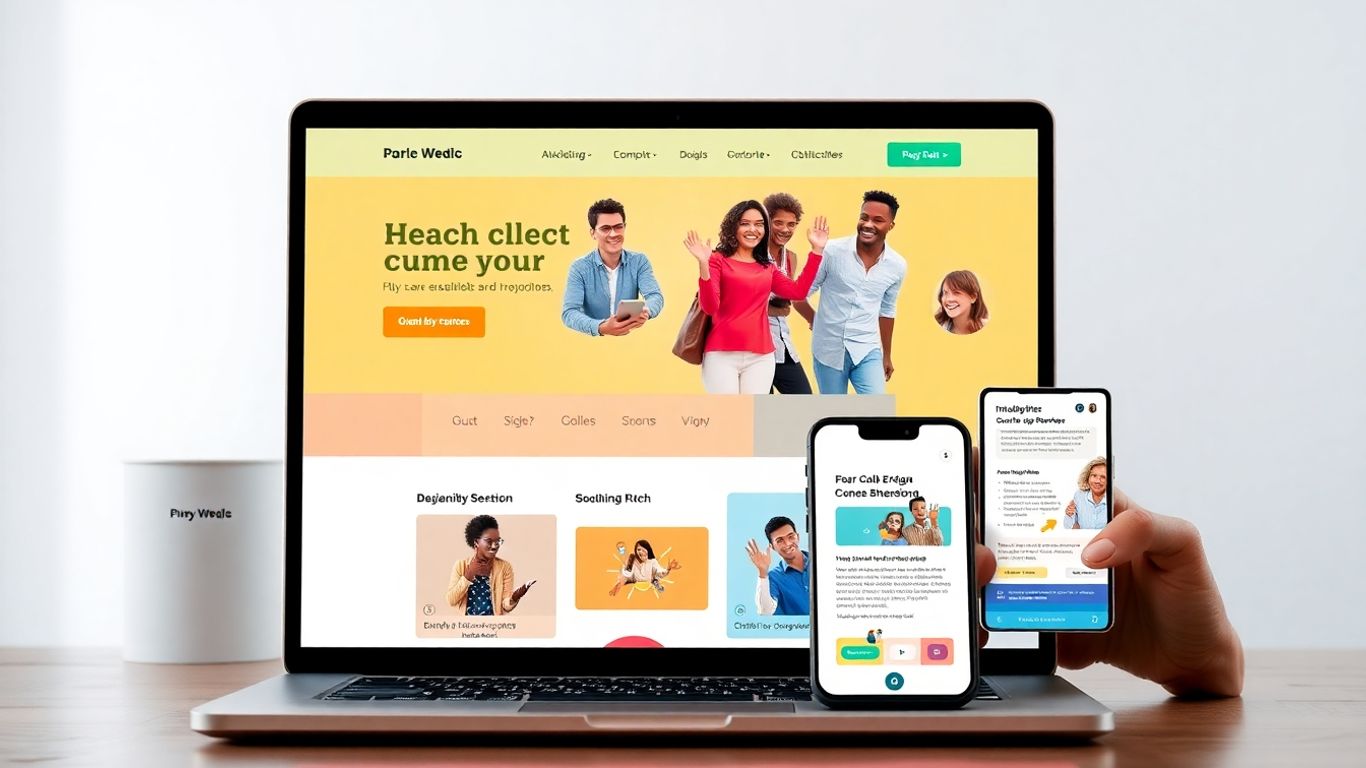
Responsive Design and Accessibility as Engagement Drivers
Building a website that works for everyone isn't just about looking good—it's about making sure people can actually use it, no matter where or how they're visiting.
Ensuring Seamless Experiences Across Devices
People bounce between laptops, phones, and tablets all day, so your site should feel the same everywhere. Sites that aren't responsive can frustrate users and send them running.
Some big points to cover:
- Responsive sites adapt to any screen, cutting down on annoying zooming and side-scrolling.
- Prioritizing core content helps users find what matters fast, even on tiny screens.
- Speed impacts both experience and ranking—faster sites keep people engaged longer.
A great way to see tangible improvements from responsive design is in bounce rate, as users on mobile stick around more when pages load quickly and layouts adjust smoothly. For a more complete view of why responsive design matters, take a look at this overview of SEO-friendly web design.
| Device Type | Bounce Rate Before Responsive (%) | Bounce Rate After Responsive (%) |
|---|---|---|
| Desktop | 55 | 50 |
| Mobile | 68 | 51 |
| Tablet | 62 | 49 |
The less work you make your visitors do, the more likely they are to stay, read, and act. So, don't make users pinch and zoom—let your site adapt instead.
Designing for Inclusive Accessibility
It's easy to forget about accessibility when you're focused on colors and layouts, but not everyone interacts with your website the same way. Making your design accessible means:
- Using clear alt text for all images.
- Making sure the site can be navigated by keyboard alone.
- Picking color combinations with enough contrast for people with vision differences.
Even simple steps, like keeping navigation straightforward and offering readable fonts, help a wider range of users. Online, this isn't just polite—it's smart business. More people can use your site, which means more eyes on your offers or content.
Adapting Layouts and Colors for Mobile Users
Mobile users behave differently—they're usually distracted, one-handed, and working with less screen real estate. What works great on a desktop often turns into a mess on a phone. To keep them engaged:
- Stack content vertically and keep important buttons within easy thumb reach.
- Use larger fonts and tap targets so users don’t hit the wrong link.
- Simplify menus—no 10-item navigation bars.
- High contrast is even more important outdoors (think bright sunshine on phone screens).
And, don’t be afraid to test with real phones and real users. You might be shocked at how little changes, like shifting a button or increasing contrast, can keep people from giving up halfway through your site.
User Research and Testing: Refining On-Page Experiences
Getting people to actually use your site the way you hope isn’t just about luck—it’s about paying close attention to what works, what doesn’t, and how folks actually behave. If you’re not checking in with real users and tweaking things as you go, you’re kind of flying blind. Gathering data and feedback straight from your visitors is one of the best ways to figure out what needs to change on your site. Regular testing and research keep you from sinking hours into features or layouts that nobody wants.
Utilizing Heatmaps and Analytics to Inform Design
Heatmaps give you a literal look at where users are clicking or pausing. Paired with analytics, they answer questions you might not even think to ask. For example:
| Metric | What It Shows | Informs Change? |
|---|---|---|
| Click Heatmap | Hotspots & dead zones | Move buttons, edit CTAs |
| Scroll Depth | Where users drop off | Adjust content order/length |
| Session Duration | How long users engage | Identify engagement drains |
- Spot overlooked sections where nobody clicks.
- See where users give up and leave.
- Use this info to tweak layouts, highlight offers, or make navigation easier.
Looking at site data can be an eye-opener—sometimes the things you thought were obvious are totally invisible to your audience.
Conducting A/B Tests for Continuous Improvement
Let’s be honest, guessing what works rarely pays off. A/B testing—showing different versions of a page to groups and tracking which one does better—takes out the guesswork. Here’s a quick rundown:
- Identify a goal (such as more button clicks or email signups)
- Create two versions of a page or feature (A and B)
- Split your audience evenly and serve each a variant
- Measure which gets better results
- Keep the winner, and test again with something new
Some stuff you can A/B test:
- Calls-to-action in headlines
- Button colors and placements
- Length and style of signup forms
Gathering Feedback to Optimize User Journeys
Analytics and tests are awesome, but sometimes you just have to ask people directly. Send out surveys, use live chat prompts, or even run user interviews if you can wrangle volunteers. Focus on:
- Pain points where users get stuck or confused
- Features users wish existed (or wish were gone)
- What made them feel confident (or hesitant) about their choices on your site
Combining hard data with these real, human stories helps you decide what needs fixing for a more enjoyable experience. Iterate, test, ask again—then watch your engagement start to climb.
Understanding how people use your website is important. By running simple user research and testing, you can find out what works and what needs to be better. This helps you make changes so everyone has an easier time on your site. Ready to give your users the best experience? Visit our website now and see how we can help you improve!
Conclusion
So, that's the gist of it. Mixing design psychology with SEO isn't just about making things look pretty or stuffing in keywords. It's about thinking through how people actually use your site—what catches their eye, what makes them want to click, and what keeps them around. Colors matter more than you might think, and the way you lay out your content can totally change how folks interact with your page. Even the words you choose can nudge someone to take action or just bounce. At the end of the day, it's all about making your website easy to use, pleasant to look at, and clear in its message. Try out different ideas, pay attention to what your users do, and don't be afraid to tweak things as you go. Sometimes the smallest changes can make the biggest difference in keeping people engaged.
Frequently Asked Questions
How does color affect how people feel on a website?
Colors can make people feel different emotions. For example, blue can make users feel calm and safe, while red can create excitement or urgency. Picking the right colors helps set the mood and can make visitors want to stay longer or take action.
What is the F-pattern and why is it important for web design?
The F-pattern is how most people read web pages—they look across the top, then down the left side, and sometimes across again. By putting the most important stuff, like headlines or buttons, in these spots, you make sure users see them first.
Why should call-to-action buttons stand out?
Call-to-action (CTA) buttons tell users what to do next, like 'Sign Up' or 'Buy Now.' If they blend in, people might miss them. Using bright colors, bigger sizes, or bold words helps CTAs grab attention and get more clicks.
How does good copywriting help keep users interested?
Simple, clear, and friendly writing makes it easier for visitors to understand what your site is about. Good headlines and stories can make people want to read more, while strong CTAs encourage them to take action.
What is social proof and how does it build trust?
Social proof is when you show that other people like your website or product, like with reviews or testimonials. When visitors see that others trust you, they’re more likely to trust you too and feel comfortable making a choice.
Why is it important to test your website with real users?
Testing your site with real people shows you what works and what doesn’t. Feedback, heatmaps, and A/B tests help you find problems and make changes, so your website is easier and more fun for everyone to use.


Comments
Post a Comment