Design with Purpose: Making Every Site Element Work for Your Goals
So, you've got a website, but does it actually do what you want it to? It's easy to just throw stuff online and hope for the best, but that's not really how it works. We need to think about why we're putting this site out there in the first place. Design with Purpose: Why Every Element on Your Site Should Work for You is all about making sure every button, every picture, and every word has a job to do. It’s about making your site work smarter, not just harder, to get you where you want to go. Let's break down how to make that happen.
Key Takeaways
- Figure out the main reason your website exists. This 'why' should guide all your design choices.
- Make sure your website design matches what users need and want to do.
- Focus your pages on one main goal to help people take the action you want.
- Keep your site's look and feel the same everywhere, especially matching your ads.
- Use pictures and clear calls to action to guide visitors and build trust.
Define Your Website's Core Purpose
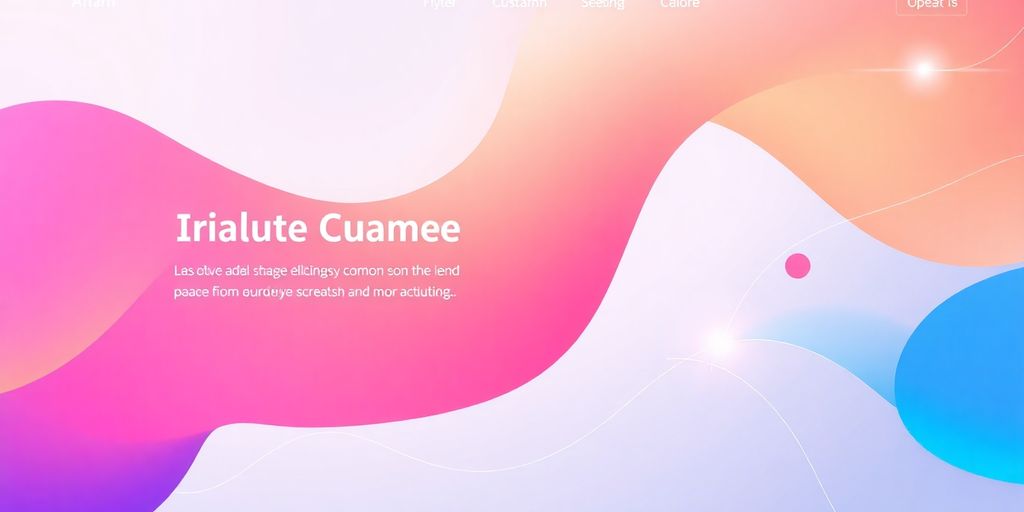
Your website's homepage is like the main entrance to your business online. It's usually the first thing people see, so it really needs to make a good impression and tell them what you're all about right away. Think of it as the digital handshake. If it's confusing or doesn't clearly state your purpose, visitors might just turn around and go somewhere else. Getting this first impression right is key to keeping people engaged.
Prioritize Elements Based on Your 'Why'
When you're building your site, you have to decide what's most important. What's the main reason your website exists? Is it to sell products, get people to sign up for a newsletter, or maybe just share information? Once you know your main goal, you can start putting the most important things front and center. Everything else should support that main goal.
Align Design with User Needs and Goals
It's not just about what you want your website to do; it's also about what the people visiting your site want to do. What are they looking for when they arrive? Do they need quick answers, a way to buy something, or information to help them make a decision? Your design should make it easy for them to find what they need. If your site helps users achieve their goals, they're more likely to stick around and come back.
Avoid Conflicting Site Objectives
Sometimes, websites try to do too many things at once, and it ends up confusing everyone. If your homepage is trying to get people to buy a product, sign up for a webinar, and read your latest blog post all at the same time, it can be overwhelming. It's better to have a clear primary objective for your homepage and maybe secondary objectives that don't distract from the main one. This keeps the user focused and makes it more likely they'll complete the action you want them to take. Trying to be everything to everyone usually means you end up being nothing to anyone.
Your website's purpose should be crystal clear from the moment someone lands on your homepage. If visitors can't quickly understand what you do and why they should care, they'll likely leave. Focus on communicating your core message effectively and guiding users toward a specific action.
Create Focus for Conversion-Centered Design
When you're trying to get people to do something specific on your website, like buy a product or sign up for a newsletter, you need to make it super clear what that one thing is. Too many choices can actually make people do nothing at all. It’s like standing in front of a huge menu and ending up just ordering water because you can't decide. This is often called analysis paralysis. Your website, especially a landing page, should guide visitors toward a single, main goal. Every single thing on that page needs to help with that one objective.
Identify the Single Goal for Your Landing Page
Think about what you absolutely need a visitor to do when they land on a specific page. Is it to fill out a form? Click a button to learn more? Download a guide? Pick just one. Trying to get them to do five different things at once usually means they won't do any of them. This focus is the bedrock of getting people to act.
Eliminate Distractions to Guide User Action
Once you know the main goal, get rid of anything that might pull people away from it. This means cutting out extra links, unrelated information, or too many visual elements that don't support the primary action. If your goal is to get someone to sign up for a webinar, don't also have prominent links to your blog or social media feeds right next to the signup form. Keep the path clear.
Ensure Every Element Serves the Primary Objective
Look at every button, image, and piece of text on your page. Ask yourself: Does this help the visitor achieve the main goal? If the answer is no, or if it's just 'maybe,' it's probably a distraction. For example, if you're selling a specific service, the images should show the benefits of that service, not just random stock photos. Every part of the page should be working towards that one conversion goal, making it easier for the visitor to take the desired action. This focused approach is key to achieving online success.
Structure Your Site for User Guidance
Think about how people move through your website. It’s not just about putting information out there; it’s about making it easy for visitors to find what they need and do what you want them to do. A well-structured site guides users naturally, like a helpful signpost on a trail. If things are messy or confusing, people will just leave. We want them to stick around and take the next step, whatever that might be.
Design Information Hierarchy Effectively
This means organizing your content so the most important stuff is easy to spot. Imagine a newspaper – the biggest headlines are right at the top. Your website should do the same. Figure out what your visitors are looking for most and make that information prominent. Use headings, subheadings, and clear spacing to break up text. This helps people scan the page quickly and find what matters to them without getting lost.
Optimize Page Layout for Actionable Paths
Once you know what information is most important, think about how to arrange it on the page. Where do you want people to click next? Your layout should lead them there. Think about placing key calls to action, like a "Sign Up" or "Learn More" button, in spots where they're hard to miss. Avoid putting too much on one page, which can overwhelm visitors. Instead, create clear paths that encourage them to explore further or complete a specific task. This is where understanding website development tips really comes into play.
Influence Visitor Behavior Through Structure
How you arrange elements on a page can actually change how people interact with it. If you want people to sign up for your newsletter, make that signup form easy to find and fill out. If your goal is to get people to read more about your services, make sure those links are clear and inviting. It’s about subtly guiding their actions by making the desired path the easiest and most obvious one.
People often scan web pages rather than reading every word. Your site structure should support this scanning behavior by using clear headings, bullet points, and short paragraphs. This makes it easier for visitors to quickly grasp the main points and find the information they need.
Maintain Consistency Across Your Digital Presence
Think about your website like a conversation you're having with someone. You wouldn't suddenly change your accent or start talking about something completely different halfway through, right? Your digital presence should be the same way. Keeping things consistent across your website, your social media, and even your ads makes you look more put-together and trustworthy. It helps people recognize you and feel comfortable. If your Facebook ad looks nothing like your website, that's a red flag for visitors.
Align Design with Advertising Matching
When you run an ad, whether it's online or even a flyer, make sure the look and feel match what people see when they click through to your site. This means using the same colors, fonts, and general style. If your ad promises a sleek, modern experience, your website needs to deliver that same vibe. It's about creating a smooth transition for the user, so they don't feel like they've landed in the wrong place. This consistency helps build confidence in your brand.
Adhere to Established Design Guidelines
Most brands have a set of rules, often called brand guidelines, that dictate how their logo, colors, and fonts should be used. Following these rules is super important. It's not just about making things look pretty; it's about making sure everyone who interacts with your brand gets the same impression. This applies to everything from your website's header to the buttons on your contact page. Think of it as the brand's DNA – it needs to be consistent everywhere.
Ensure Brand Consistency for Trust
When everything looks and feels the same across all your online platforms, it builds trust. People start to recognize your brand instantly, and they know what to expect. This familiarity makes them more comfortable engaging with you, whether that's signing up for a newsletter or making a purchase. A consistent brand presence signals professionalism and reliability. It shows you pay attention to the details, which often translates to how you handle your business and customer service. Building that trust is key to getting people to stick around and become loyal customers. We're always working to make our own site more inclusive and accessible. We believe accessibility is an important web design principle that everyone creating a website should strive to follow.
Leverage Visuals to Showcase Benefits
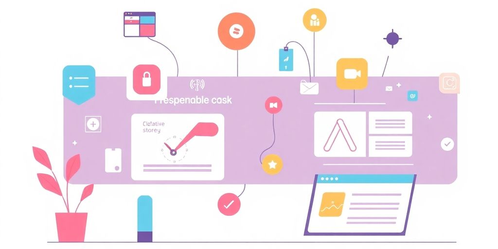
Sometimes, just telling people what you do isn't enough. You really need to show them how it makes their lives better. Think about it – when you're looking at products or services, you're not just buying features, you're buying the outcome, the feeling, the solution to a problem. That's where visuals come in. They're your secret weapon for making those benefits jump off the screen.
Choose Images That Highlight Product Advantages
Don't just pick pretty pictures. Look for photos or graphics that actually demonstrate what your product or service does for someone. If you sell comfortable shoes, show someone walking with a relaxed smile, not just a close-up of the shoe's sole. It’s about connecting the visual to the positive result. A good website designer knows how to pick these kinds of images.
Use Visuals to Communicate Value Proposition
Your value proposition is what makes you stand out. Visuals can communicate this quickly and effectively. For example, if your company offers fast delivery, a visual showing a package arriving promptly can say more than a paragraph of text. It’s about making the abstract idea of 'value' concrete and easy to grasp. Think about how a simple graphic can show time saved or a problem solved.
Select Imagery That Resonates with Your Audience
Who are you trying to reach? The images you use should speak to them. If your audience is young and energetic, use vibrant, dynamic visuals. If they're more professional and serious, opt for cleaner, more sophisticated imagery. It’s like speaking their language, but with pictures. Showing people who look like your target customers, happy and successful, can make a big difference.
Draw Attention to Key Site Elements
You want people to notice the important stuff on your website, right? It’s like putting a spotlight on the main attraction. Think about it – why do some ads just grab you instantly? It’s usually because they know how to make certain things pop. We can do the same for our websites. It’s not about being flashy; it’s about being smart with how we guide someone’s eye.
Utilize Color to Highlight Call-to-Action Buttons
Color is a powerful tool. It can change how someone feels and what they do. For buttons, especially those that ask people to take action, like 'Buy Now' or 'Sign Up,' using a color that stands out from the rest of the page is key. This doesn't mean using neon green on a purple background, but rather a color that contrasts well and fits the overall look. Think about how a bright red stop sign gets your attention. We can use similar principles, but in a way that feels natural to your brand. A well-chosen color for a button can make a big difference in how many people click it. It’s a simple way to make your call-to-action buttons more effective.
Employ Typography to Guide User Focus
How you use text matters a lot. The size, style, and spacing of your fonts can direct where someone looks on a page. Big, bold headings draw the eye first. Then, smaller text provides the details. If you want someone to read something specific, like a special offer or a key benefit, making that text slightly larger or a different style can help. It’s like using different voices in a conversation – some parts are more important and need to be heard louder. This helps people scan your page and find the information they need without getting lost in a wall of text. Good typography makes your content easier to digest and keeps users engaged with your website content.
Strategically Place Elements for Maximum Impact
Where you put things on a page is just as important as what they are. People tend to look at certain areas of a page first, like the top left or the center. If you have something really important, like a signup form or a link to a product, putting it in one of these prime spots can get it noticed more. It’s also about giving important elements space to breathe. Too much clutter makes everything blend together.
Giving your most important benefits or CTAs more room to breathe, often called "white space" or "negative space" in design, proves that sometimes less is more. It helps important elements stand out.
Think about how a single item in a display case gets more attention than if it were surrounded by a dozen other things. This thoughtful placement helps guide visitors toward the actions you want them to take, making your site more effective.
Build Trust Through Credibility and Proof
When people visit your website for the first time, especially from an ad, they're taking a chance. The internet has a lot of questionable sites out there, and yours needs to stand out as legitimate. You have to actively build trust. This means showing proof that you're a real, reliable business. Think about it: would you buy something from a stranger who just made a bunch of claims, or from someone who had a line of happy customers outside?
Incorporate Testimonials for Social Proof
Testimonials are great, but a poorly done one can actually hurt more than help. If you don't include enough detail, people might think you just made it up. To make your testimonials believable and useful, make sure they have:
- Enough personal details to feel real and relatable.
- Clear placement within your site's overall structure, so they don't get lost.
- Other forms of proof like awards, ratings, or customer logos if they fit.
People are smart. They can tell if you're faking reviews or inflating your scores. Don't give them a reason to leave your site and look for outside opinions. Make your proof solid.
Display Customer Logos to Validate Your Brand
Seeing familiar company names can really make a difference. If you've worked with well-known brands, showing their logos on your site acts as a quick stamp of approval. It tells potential customers that other businesses trust you enough to work with you, which can be a powerful signal. This is a simple way to show you're a legitimate business partner.
Design for Credibility to Enhance Visitor Confidence
Beyond testimonials and logos, think about the overall feel of your site. Does it look professional? Does it load quickly? Are there any broken links or confusing navigation? A polished and functional website design is key. It signals that you pay attention to detail and care about the user experience. This attention to detail builds confidence and makes visitors more likely to stick around and explore what you have to offer. A well-designed site is often the first step in building that all-important visitor confidence.
Building trust is key, and showing proof makes people believe in you. We help you prove your worth with solid evidence. Want to see how we can build your credibility? Visit our website today to learn more!
Putting It All Together
So, we've talked a lot about making sure every bit of your website has a reason for being there. It's not just about making things look pretty; it's about making them work for you and for the people visiting your site. Remember to keep your main goal in mind, know who you're talking to, and make it easy for them to do what you want them to do. When you design with a clear purpose, your website will feel more helpful and get better results. It might take a little extra thought upfront, but a site that's built with intention is always worth the effort.
Frequently Asked Questions
What's the most important thing to figure out before designing a website?
Think about what you want people to do when they visit your site. Do you want them to buy something, sign up for a newsletter, or just learn more? Your website's main goal should guide all your design choices.
Why is it important to have a single goal for a webpage?
You should focus on one main goal for each page, especially landing pages. This helps visitors know exactly what to do without getting confused by too many options or extra links.
How does consistency help a website?
Make sure your website looks and feels the same everywhere, just like your ads or social media. This helps people recognize your brand and builds trust.
How can images help sell something on a website?
Use pictures that show off what makes your product or service great. Good images can quickly explain the benefits and make people more interested.
How can colors and text help guide visitors?
Use bright colors for important buttons like 'Buy Now' or 'Sign Up'. Also, choose easy-to-read fonts and place things where people are likely to look to guide them.
How can I show people that my website is trustworthy?
Show reviews from happy customers or logos of companies you've worked with. This proves that your business is real and trustworthy, making new visitors feel more confident.


Comments
Post a Comment